Our Favourite Farrow & Ball Paint Colours and How To Use Them

Few brands have nailed something so niche as Farrow & Ball. From the curiously named Elephant’s Breath to the ever-popular Hague Blue, the brand’s richly pigmented paint shades have become famous in their own right. Each have the power to ignite many a compliment of your downstairs loo, living room or kitchen cabinets, usually responded with a smug, “Oh, thanks. It’s Farrow & Ball.”
A little showy F&B may be, it is really rather good – the quality is second to none, the shades lead the way in what’s hot in interiors without falling prey to what’s cool on Instagram, and the product is easy to work with and lasts.
The British brand recently launched 11 new shades, including a warm fiery red in ‘Bamboozle’; their lightest and most delicate pink ever, ‘Tailor Tack’; and a classic charcoal in ‘Hopper Head’. If you’re a sucker for the classics, however, we’ve rounded up our all-time favourite shades from the Farrow & Ball archive. Scroll on for some inspo for your walls…
How To Style Our Favourite Farrow & Ball Paint Colours
Elephant’s Breath
The shade: Despite it being one of F&B’s most recognisable paint names, the shade is actually pretty pared back and neutral, sitting somewhere between an off-white and a warm, contemporary mid-grey.
Good to know: Like all paint shades it can vary depending on the artificial and natural light of the room, so be sure to order a test pot before committing to the whole project. In some lights, it can look very bright and white, but put it on a west-facing wall, for example, and it can show a hint of cool lilac.
Best in: Bright airy spaces. We particularly love it in a high-ceilinged bathroom with lots of natural light. Use it on different textures, from wooden furniture to floors, plaster to mantels, to create shade and texture without losing that glorious light to bask in.
De Nimes
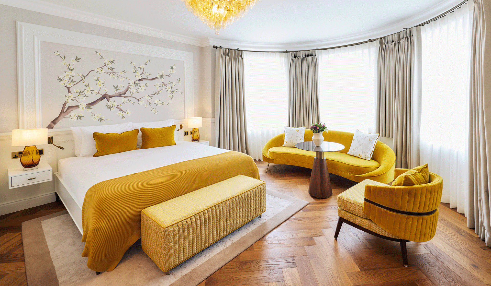
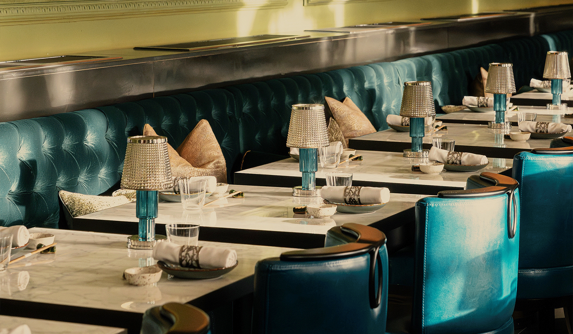
The shade: Farrow & Ball are known for their blues, from the deep dark moods of Hague Blue to the vibrant seaside-inspired Lilworth and the formal graphic feel of Drawing Room. You only have to search each of their hashtags to stumble upon a wealth of interior inspo, but it’s De Nimes that we really love. This blue seems inherently cooler than some of F&B’s bigger names with a wonderfully down-to-earth tone that can be put to pretty much every room in the house.
The exact shade is rooted in a regency palette but is inspired by the cloth of everyday workwear made in the French city Nîmes. Chic.
Farrow & Ball say: “Like denim, its blue hue is ultimately fashionable and yet always feels grounded.”
Best in: Anywhere, from front doors to downstairs loos, grand drawing rooms to kitchen islands, but we particularly love it in cosy nooks. We love how interior designer, Ann Decker Forster, pairs the moody shade with a pop of raspberry sofa, and the way Sims Hilditch Interiors have brought these panelled cabinets to life by painting the inside with the shade.
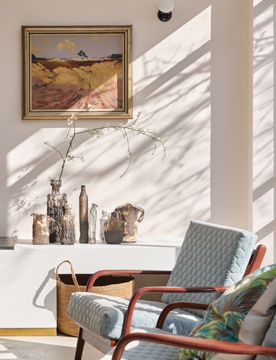
Setting Plaster
The shade: Make your walls blush with this modern classic that was created to emulate the look of newly plastered houses, making it peppy and pretty without trying too hard. Blush pink, millennial pink, whatever you want to call it, has been a huge trend in the last few years and while we still love it, it has been done to death.
Farrow & Ball’s Setting Plaster, however, holds a slightly yellowy tone, ensuring it’s not sickly sweet and still reeks of that F&B luxury.

Best in: The calming pink tone works so well in a living room you’ll want to cocoon in to it. The shade creates a wonderful backdrop to antique furniture and also works incredibly well when paired with mahogany in a more contemporary home. For a more modern approach, this shade looks cool with a slightly ’50s retro vibe when used on kitchen cabinets, as seen here in this Neal Beckstedt-designed space.
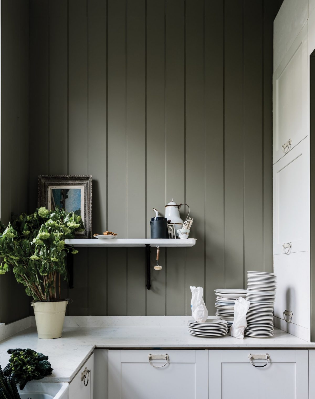
Duck Green & Sap Green
The shades: Green is overtaking blue in the Farrow & Ball popularity stakes of late, as customers look for ways to bring the outdoors in, even in inner-city properties.
Best in: We love the retro tones of Sap Green when used in a modern kitchen, and the earthy hues of Duck Green paired with a stark black and white checked floor, as seen here.
Mouse’s Back
The shade: Owing its name and shade to the fawn-coloured field mouse found all over the British countryside, this understated soft grey-brown brings a naturalistic feel to any space.
Best in: Thanks to its relaxing qualities, it’s perfect in a light-filled bedroom as seen here in this period property, or in a bathroom space paired with natural materials like stone and marble.
Farrow & Ball says: “It will read greener when used on the walls of under-lit rooms and is the perfect accent on furniture or floors.”
Treron and Pigeon
The shades: Spanning the space between two of the interior design world’s colour love affairs – grey and green – Treron and Pigeon are avian-inspired shades ideal for those who want to embrace the current green trend but aren’t quite brave enough.
Best in: We love these murky greens equally as much on natural materials such as a wood panelled wall, as we do next to contemporary industrial-style spaces – think concrete walls and dark piping.

Tailor Tack
The shade: This newbie shade is Farrow & Ball’s most delicate and lightest pink yet. It’s charming name is inspired by the thread used in France’s top Haute Couture ateliers of the same colour.
Best in: Whether you have a traditional set up or a modern space, Tailor Tack plays perfectly to both. The key is to offset it with something stronger and darker – think mid-century walnut wood or industrial accents.
Farrow & Ball says:
Perfect paired with vintage finds.