Chartreuse Is The Unlikely (But Seriously Chic) Colour Trend To Take Interiors
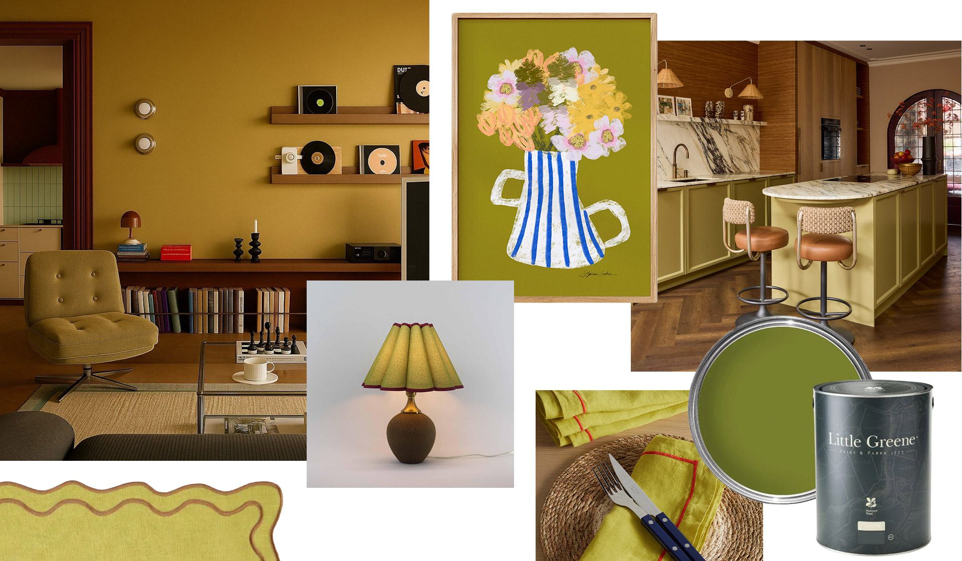
If the thought of all-white, grey, and beige interiors makes your skin crawl, this season’s standout hue is for you. Enter chartreuse: the It-shade making waves in both fashion and interiors right now. While it’s certainly no wallflower, it’s far easier to style than you might think. Here’s how to bring it into your home with confidence.
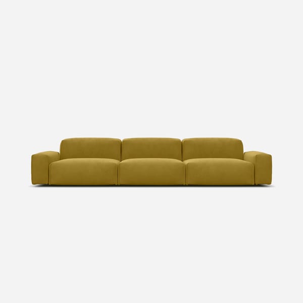
It’s no secret we love a colour trend here at The Handbook, from powdery blues paired with rich browns to warm cherry red and olive green. Our newest obsession is chartreuse. It might feel intimidating at first glance, but used thoughtfully, it can completely transform a space. The SS26 shows of Dries Van Noten, Loewe, and Dior were drenched in it, and now it has trickled into interiors, where it arguably shines brightest.
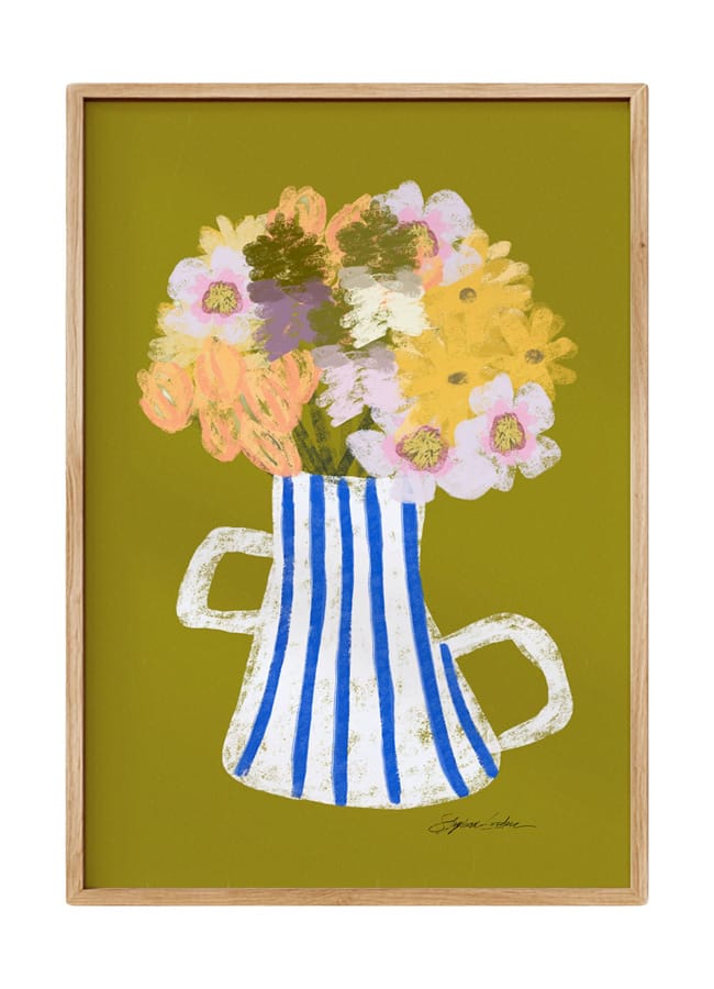
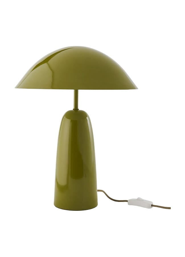
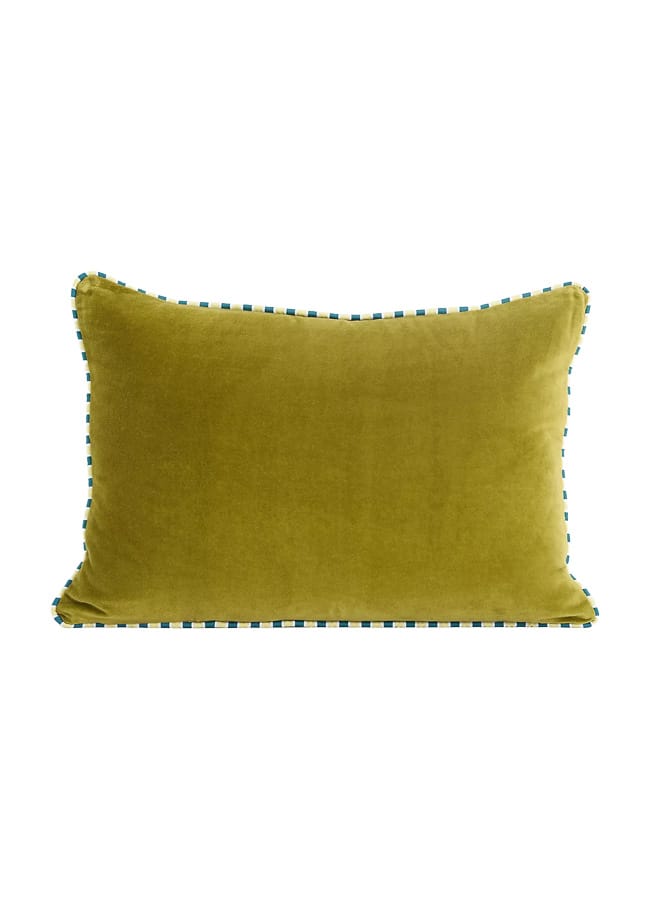
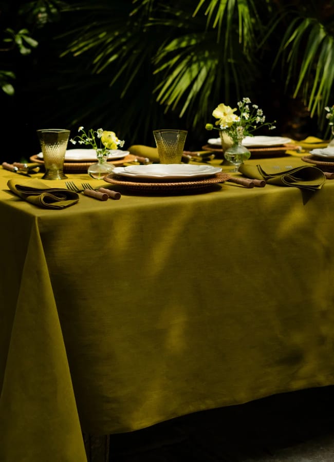
Jewel-like in tone, chartreuse is neither green nor yellow. It has a slight lime or citrine edge, but it feels far more grown-up, sophisticated, confident, and definitely a shade someone with innate style would use. We love it in soft furnishings, from a raw silk ruffled blind in the bedroom (a hint of Sofia Coppola’s Marie Antoinette about it) to a deeper version sprawled out in a rug in the living room, which would anchor a rich chocolate sofa perfectly.
While it might seem a bit of a mad shade to pick a sofa colour in, chartreuse actually pairs very well with a host of colours.
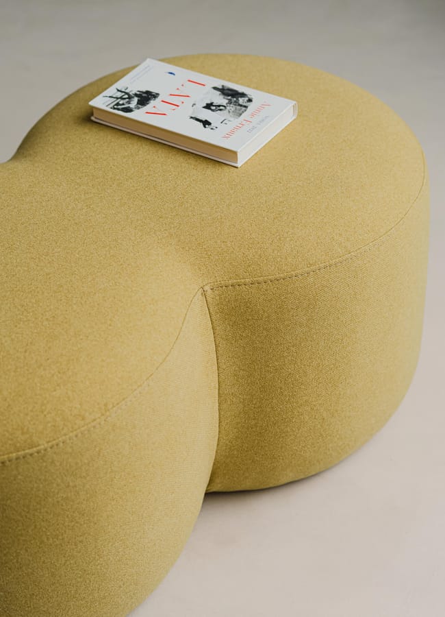
Speaking of seating, if you’re in the market for a statement sofa, this is it. It will bring a rich colour to a room, and even though it feels very vibrant and almost a bit of a mad shade to pick for a sofa colour, chartreuse actually pairs very well with a host of colours, from pale raspberry to burnt aubergine and pretty much every other shade of green you sit it beside.
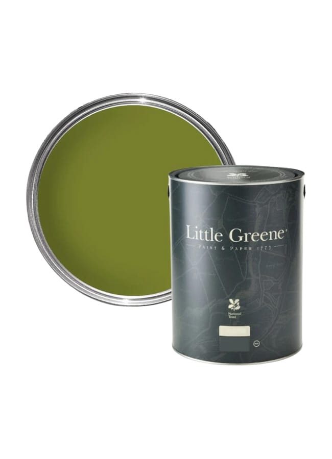
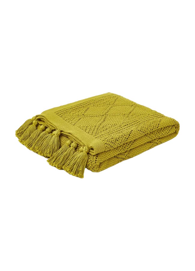
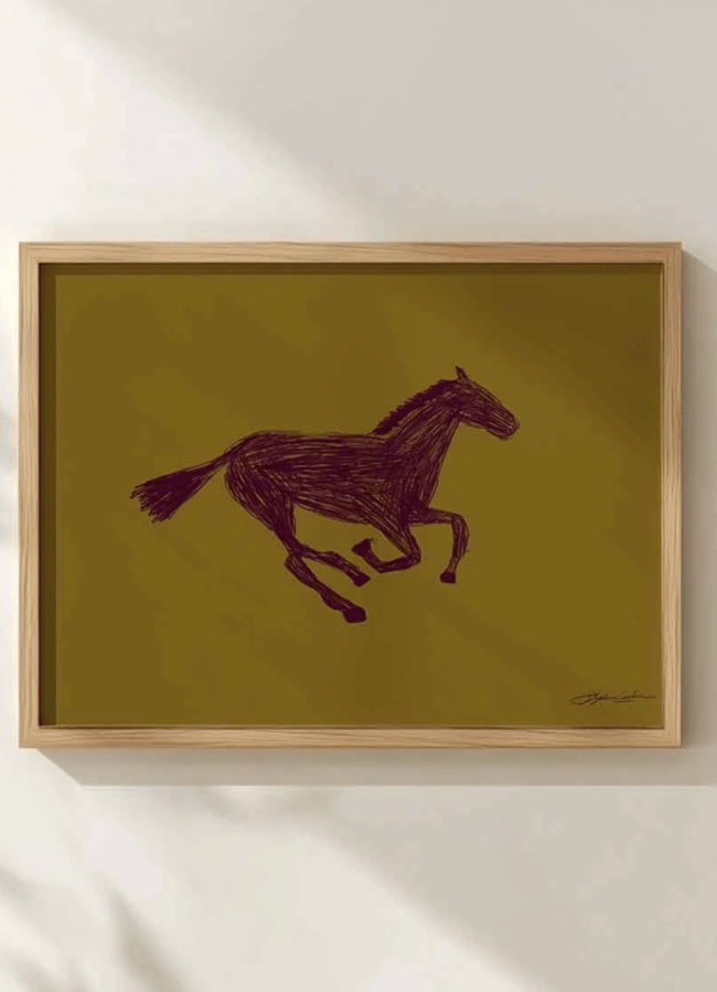
The SS26 shows of Dries Van Noten, Loewe, and Dior were drenched in it, and now it has trickled into interiors – where it arguably shines brightest.
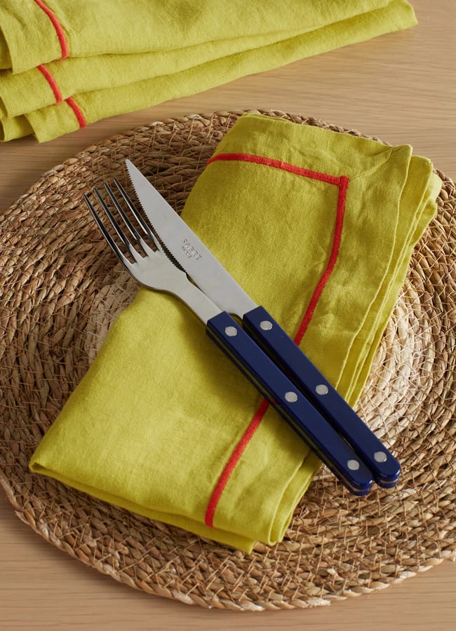
Not ready to commit to a fully colour-drenched room or a chartreuse colourful kitchen? Use it as a pop of colour accent. A striped lampshade on a bedside table, a ceramic serving dish in the dining room, or a sculptural frame atop the mantel is still impactful.
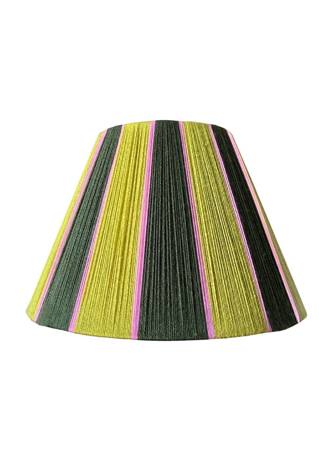
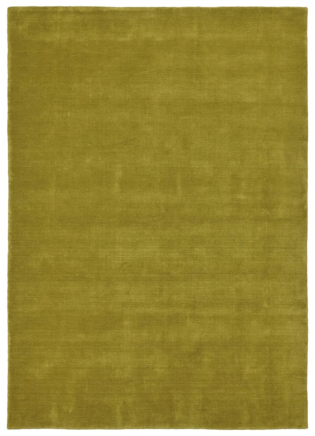
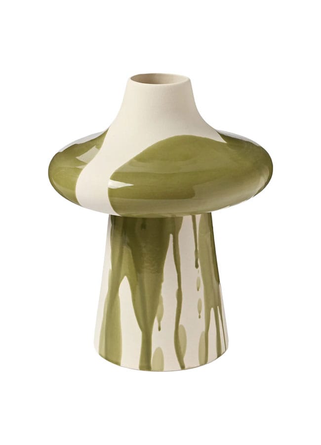
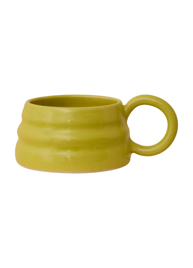
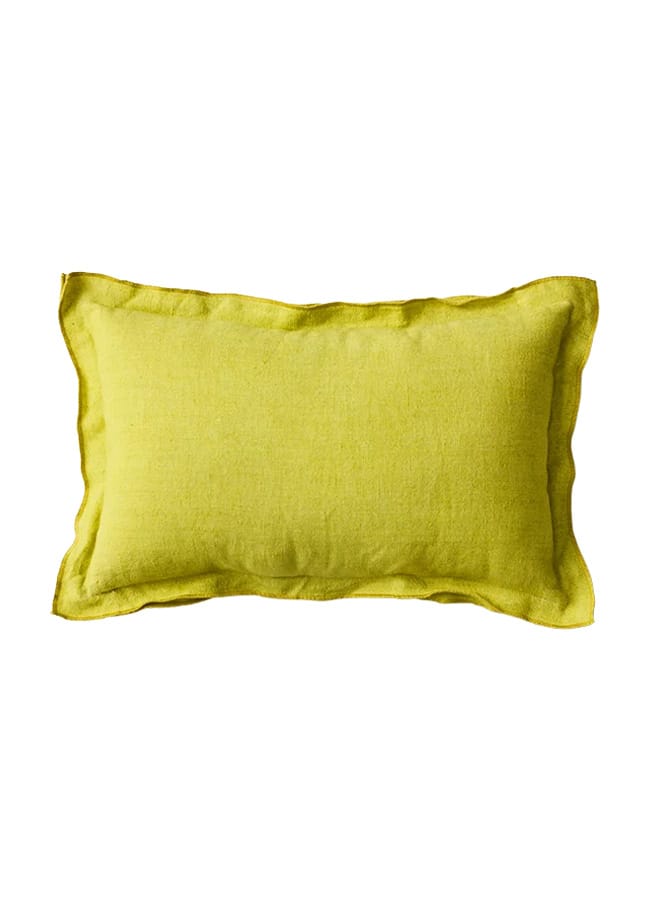
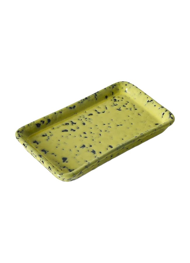
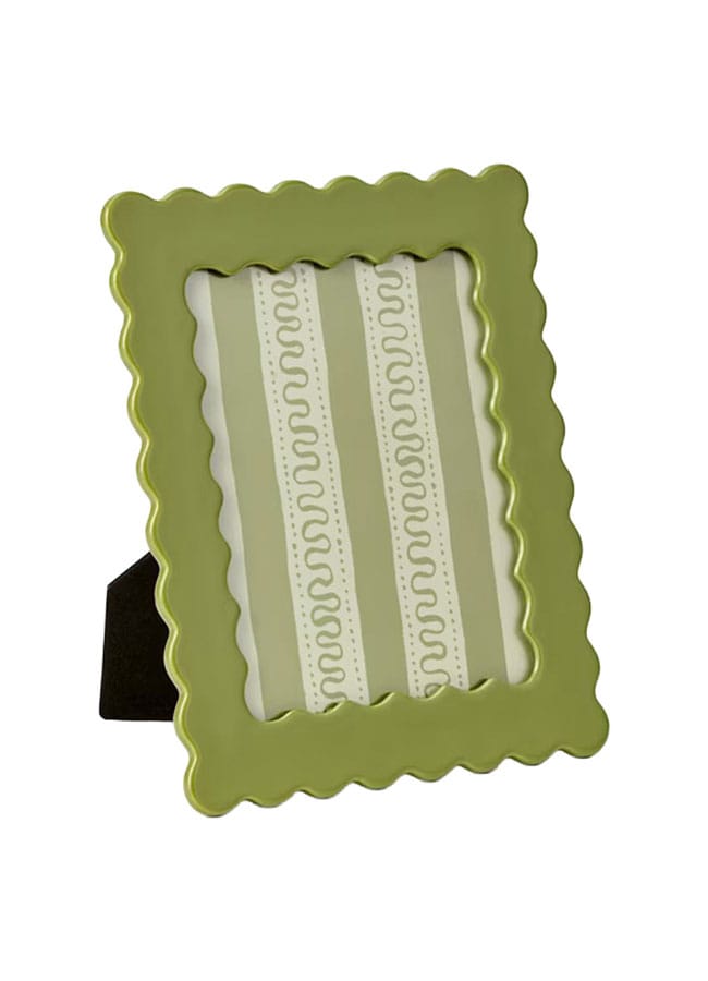
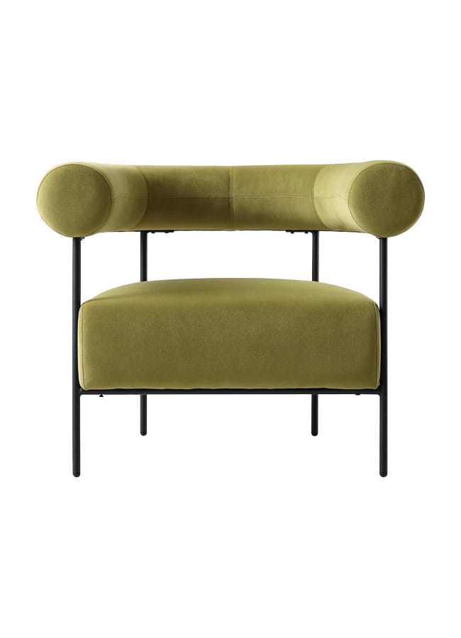
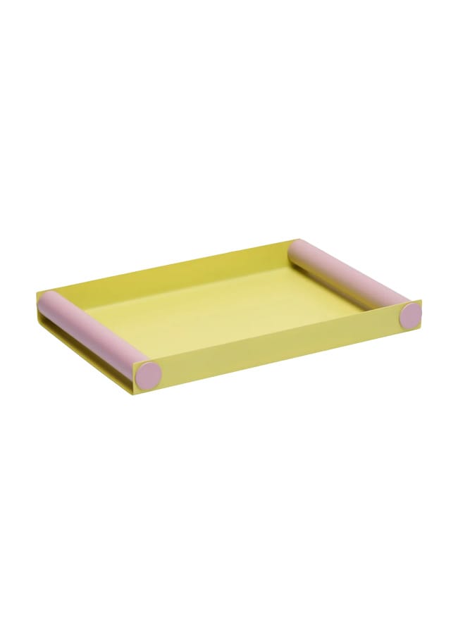
How good is this chartreuse paint colour in a dedicated grown-up space, like a listening room? The dream.

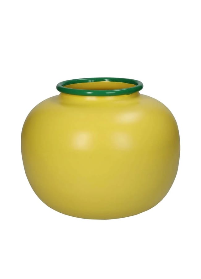
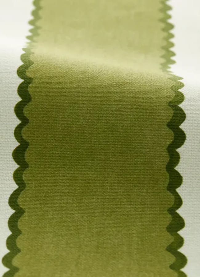
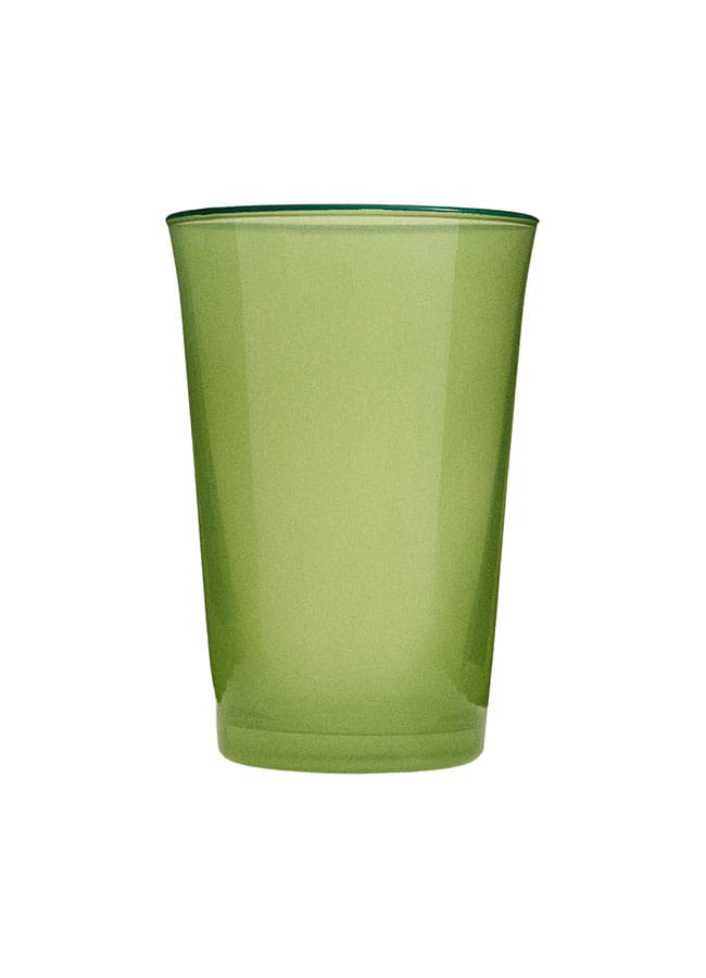
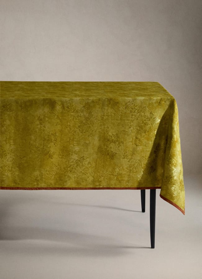
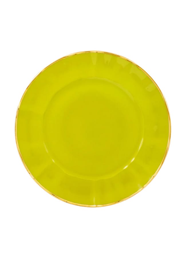
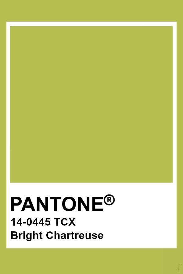
There is a spectrum, of course, when it comes to chartreuse, from the zestier lime end to a moody, earthy green. Check out Pantone’s colour charts for inspiration.
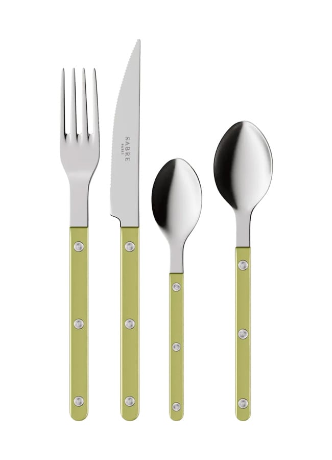

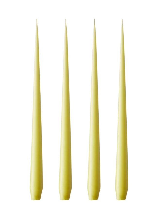
The products on this page have been selected by our editorial team, however, The Handbook may make a small commission on some products purchased through affiliate links.