The Paint Colours Trending For 2023

Feeling the need for a home revamp? Then how about a fresh new shade on the living room walls or a bold hue on those bedroom borders. We spoke to top brands to get the low down on the latest paint colour trends to transform your interiors.
It can feel overwhelming when confronted with a rainbow of swatches and colour cards. Daunting, even. So take a breath, think about how certain shades make you feel and, just as important, what ambience you want to create in each room. Do you want dopamine-inducing brights or calming neutrals? To get you started, the boutique labels below have shared their insider tips on the perfect palette, and, of course, their thoughts on what’s big for 2023. Feeling inspired? Simply click on the images below to shop.
GRAHAM & BROWN – Paula Taylor, Head Stylist
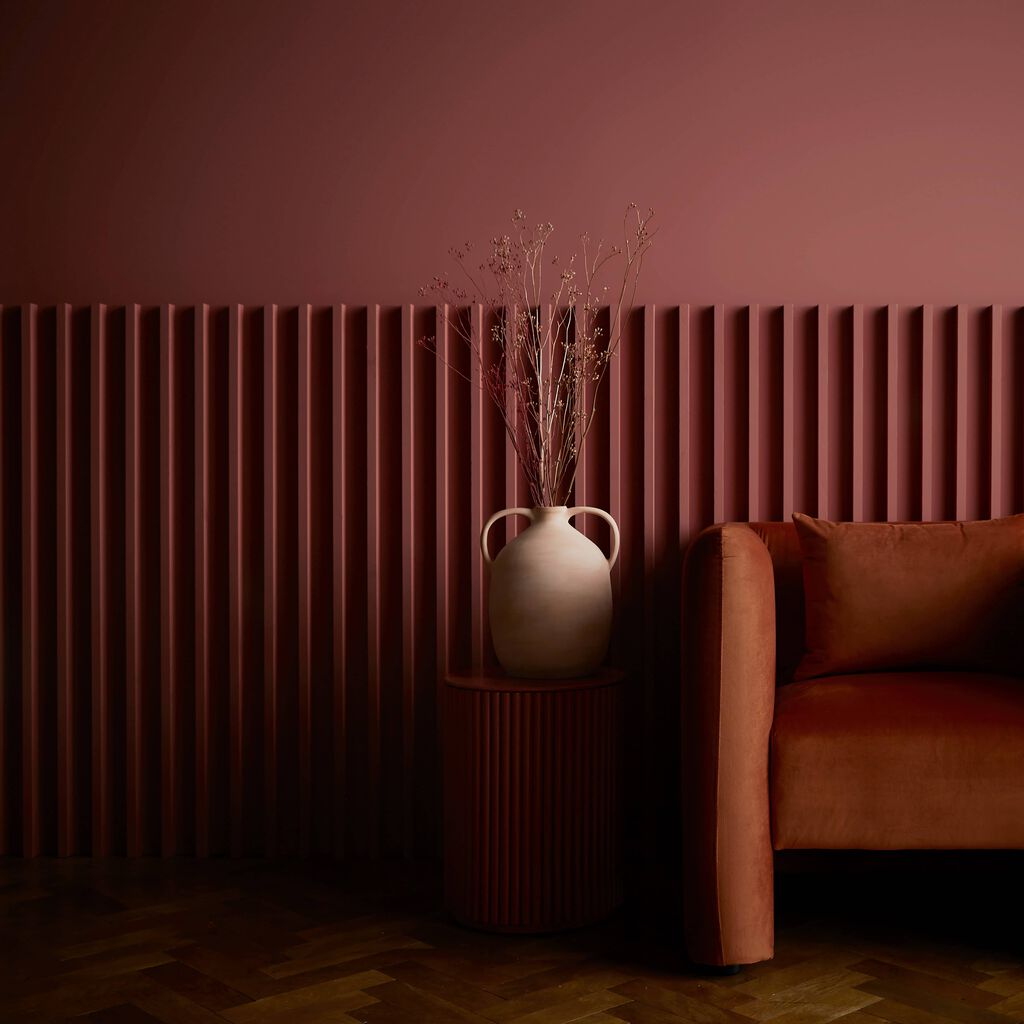
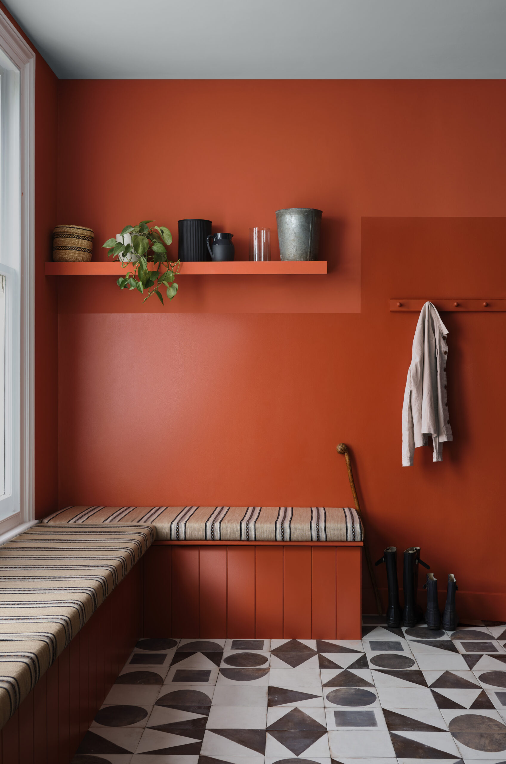
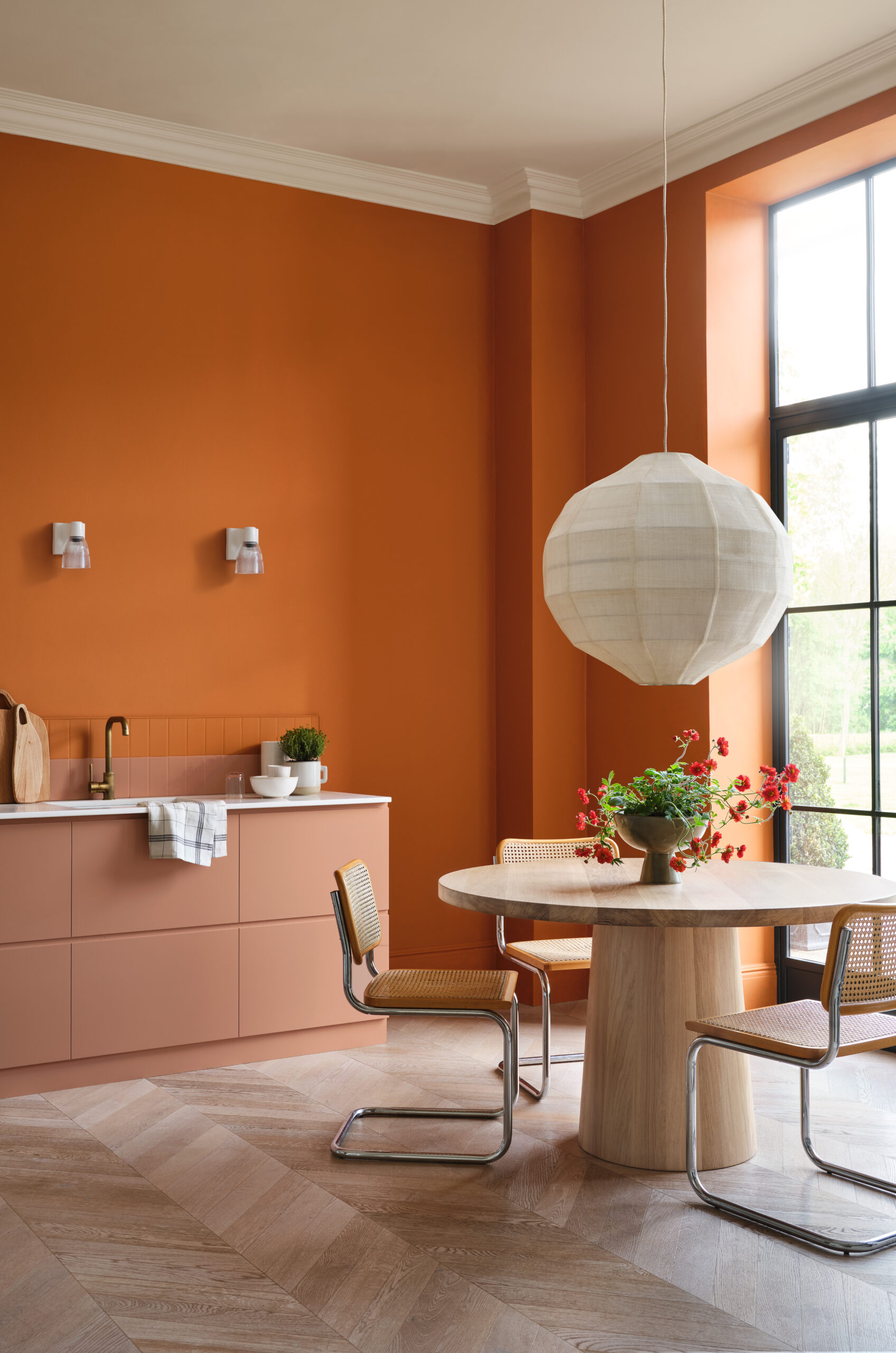
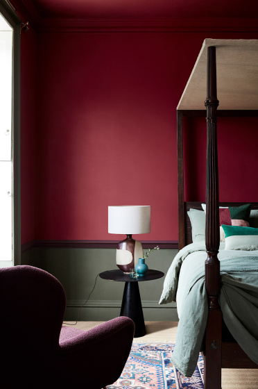
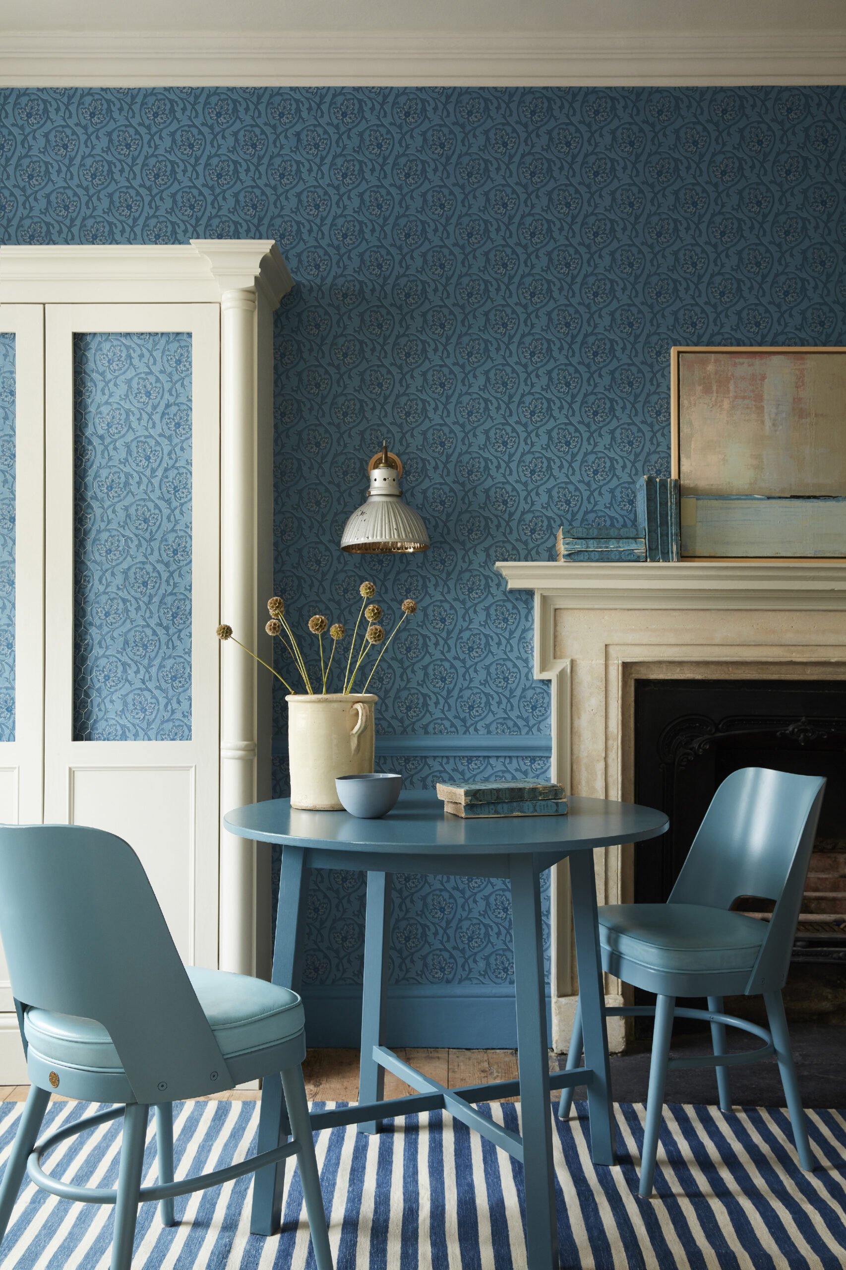
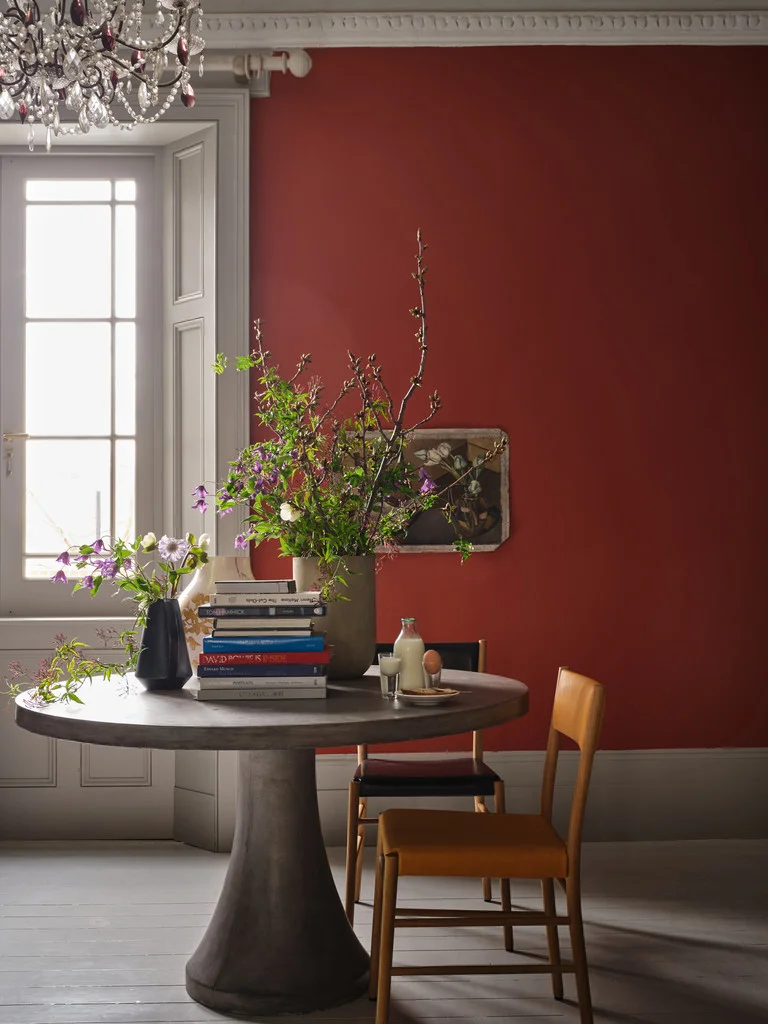
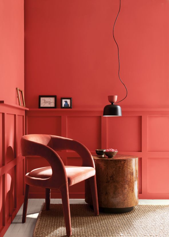
At Graham and Brown, we recently released our 2023 Colour of the Year, Alizarin. Deep and moody yet refreshingly warm, this auburn red shade is made for creating inviting spaces. Use in small areas to create a cocooning effect or transform larger rooms into an opulent abode. However, we’ve also seen a demand for nature-inspired paint colours. Sales of deep green and blue paint shades have consistently come out on top for the last three years. From rich forest greens, such as Adeline, to ocean-inspired blues such as Brave, we expect that shades that tap into biophilic design, bringing the outside in, are here to stay in 2023.
HOUSE OF HACKNEY – Steve Corcoran, Decorating Consultancy Manager
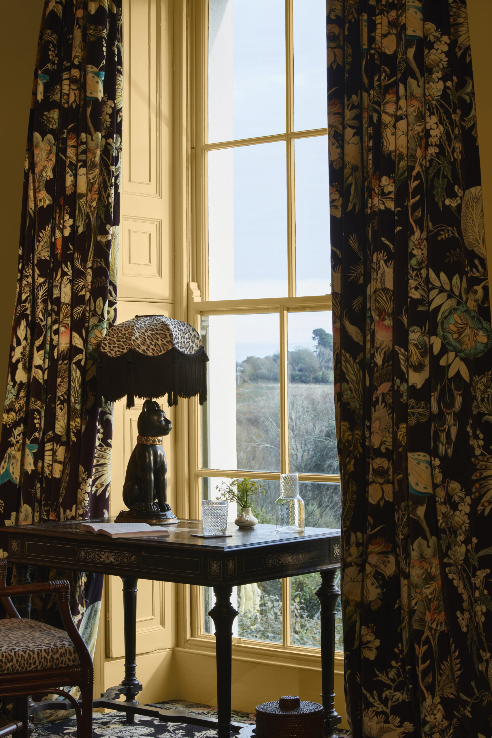
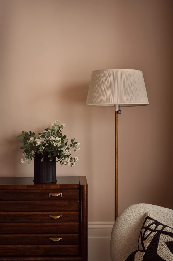
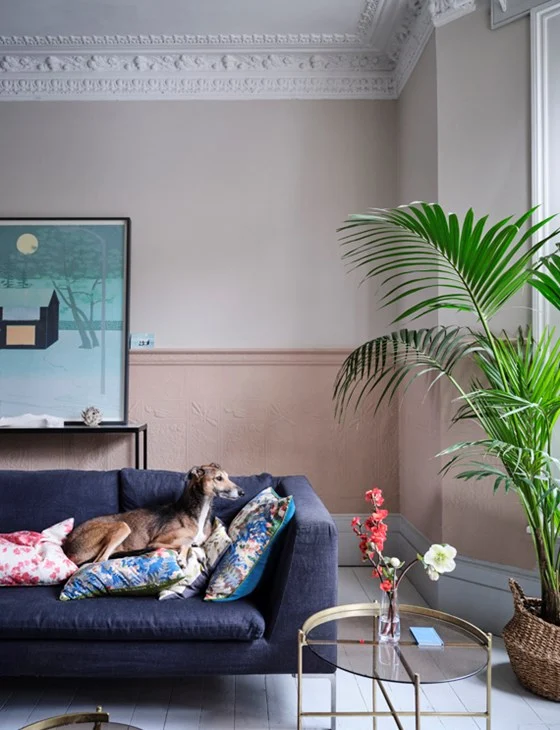
Recent trends have migrated to lighter, warmer pinks and greens which is reflected in our best selling colours: Alabaster, Serpentine and Laurustine. This journey into a more earthy palette continues this year with yellows, umbers and reds gaining popularity. This natural palette brings comfort and warmth to our interiors. Even neutrals with warm yellow undertones will provide a welcoming embrace in these uncertain times.
Carve out your ideal colour palette with Alabaster. An ode to the sculptural stone of the same name, this warm neutral is crafted from equal parts red and pink.
COAT – Aaron Markwell, Colour Consultant
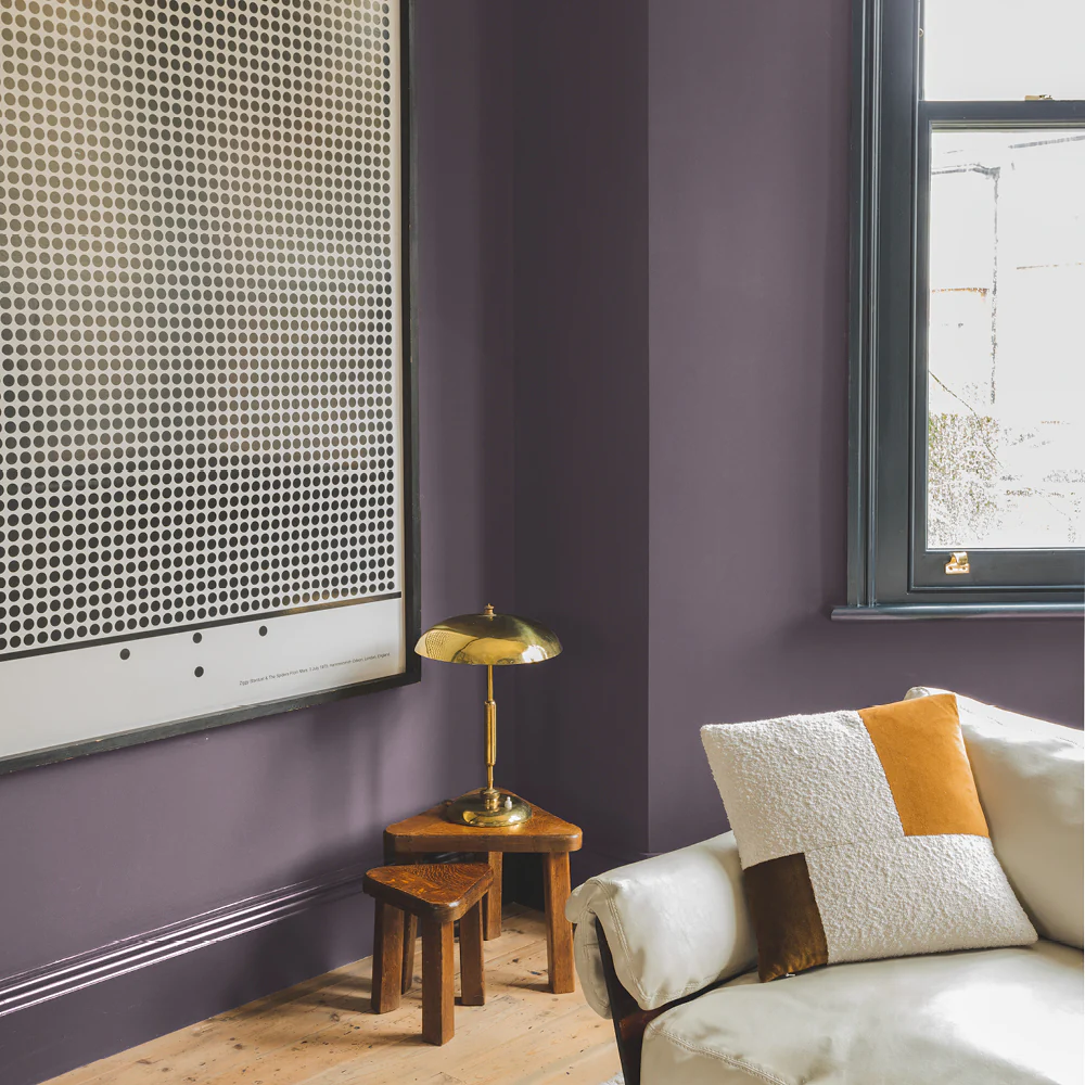
Bright taupes like COAT newcomer, Modest, are going to stay as popular as ever because they are super easy to use in almost any space. I’m also very excited about the neutral putty tone with a lilac undertone colour called Pablo, from the Laura Jackson edit. It pairs well with bright pops of saturated yellows and purples that we’re expecting to come in through accessories for 2023.
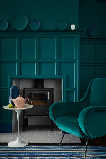
Emerald greens have been dominating the interiors’ scene for quite some time now in accessories and furniture, and I don’t think they will be disappearing anytime soon. To make these colours feel less bold, pairing them with darker tones really helps to give these emeralds some vibrancy. Dark green-ish colours like The Ranger or Hardback are perfect for making bold statements that really let your furniture sing. They also feel a little more grounded than some of the more clean, bold greens that we see in interiors.
Finally, lavenders are great colours. Using lavenders, like Shampoo & Set for woodwork or ceilings while paired with relaxed greys (Algorithm) are great for creating a zen space that feels ultra-modern.
PAINT & PAPER LIBRARY – Andy Greenall, Creative Director
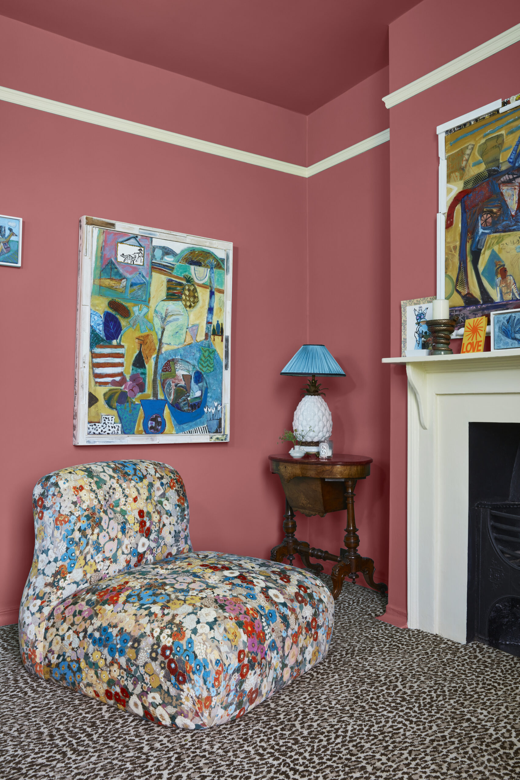
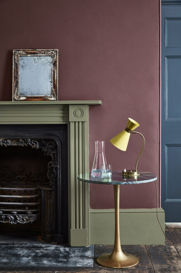
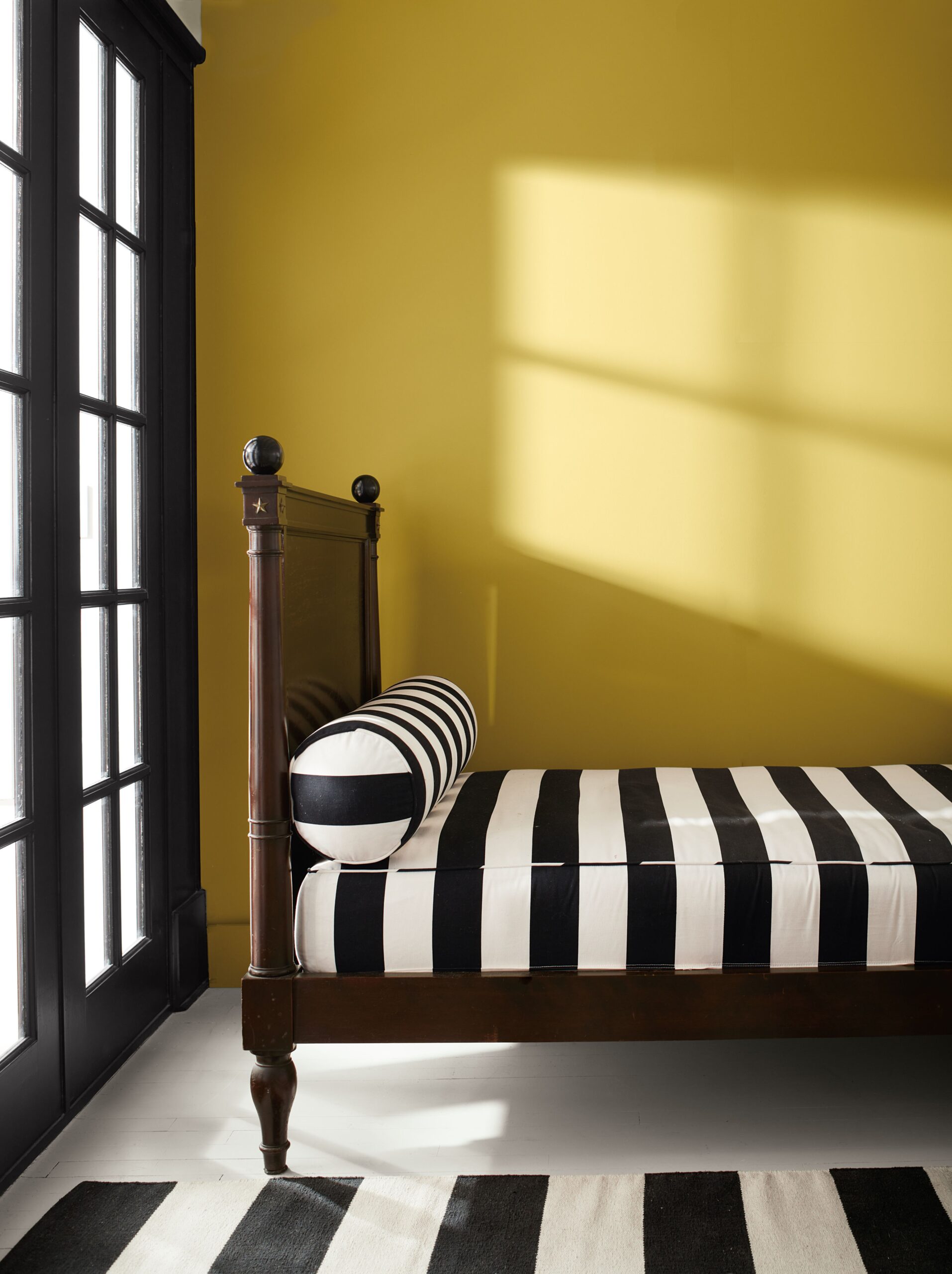
We are seeing a growing trend for rich, warm and intense colours. ‘Caravan’, for example, is an exciting Moroccan red found in the fabrics of Berber tribespeople. It brings a sophisticated warmth to a space and works beautifully alongside graphic monochrome patterns and stripes, as well as with soft warm neutrals or pale, blue-grey hues such as ‘Tablecloth’.
Both consumers and designers are turning to colour combinations that add drama and intrigue to a space, from neutrals in graduating shades which flow between rooms, to more dramatic colour pairings.
Our Architectural Colours palette has been created to be used both singularly and in combination to create bold interiors. Provided in varying strengths of the same pigment, this will create a tranquil atmosphere, whilst pairing the deepest hue with the palest will deliver an impactful scheme. ‘Powder V’ is the most intense hue which can be used to highlight architectural detailing on a ceiling and cornicing. It will create impact but remain elegant when paired with the softer hues of ‘Powder III’ on walls and the lightest hue, ‘Powder I’, on skirting and woodwork.
LITTLE GREEN – Ruth Mottershead, Creative Director
Rather than a single colour trend, we feel 2023 will see a reinterpretation of the ‘Colour Drenching’ trend. This contemporary, cohesive approach delivers high impact by painting woodwork, radiators, ceilings, and doors in the same or contrasting colour as the walls. We feel this will be adopted in wallpapers too with tonal designs being paired with coordinating woodwork and skirting.
Our new ‘National Trust Papers III’ collection offers a new approach to pattern colouration within the Little Greene collections. With many of the wallpapers being offered in bold tonal colourways, we’re reinterpreting the colour drenching paint trend that has led to enveloping and bold interiors. This collection encapsulates the same ethos of celebrating colour and pattern. It’s always fantastic to see trends that banish the habitual white skirting and doors and embrace colour and pattern!
FARROW & BALL – Joa Studholme, Colour Curator
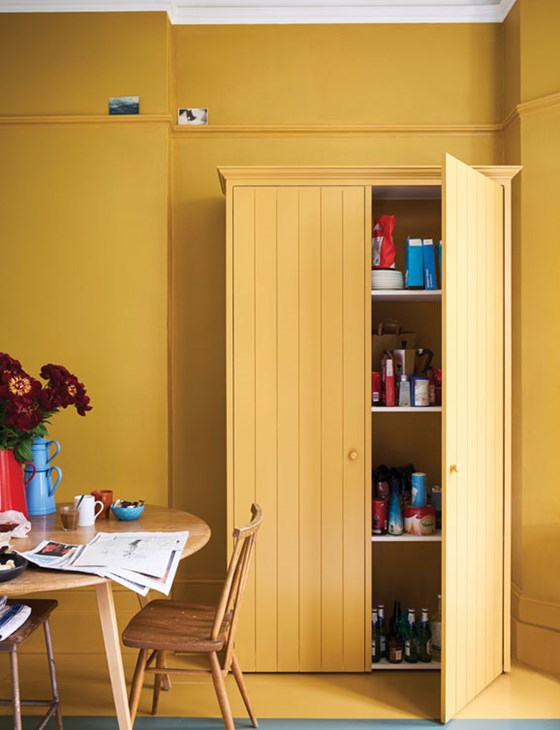
I believe the biggest paint trend in 2023 will be about how we use colour, as much as the colour itself. In the upcoming season, people will become braver in using strong colours, even if only in small amounts. For example, painting spicy Bamboozle on the inside of a cupboard to make you smile when you open it or adding earthy yellows, like India Yellow, to window frames to create a constant feeling of sunshine. And not forgetting the increasingly popular use of colour on ceilings.
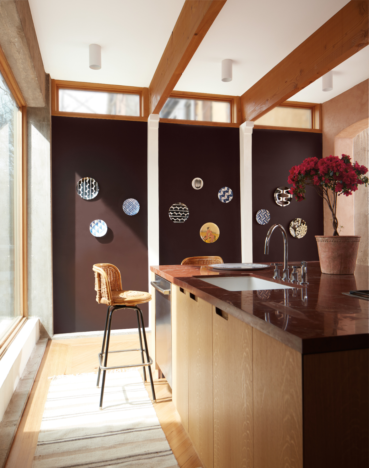
When it comes to a specific shade or colour family, we’re being drawn to warmer, earthier tones that connect us to nature. Without a doubt, reds, terracottas and browns are becoming some of the most important colours in interiors. They create a cocooning atmosphere, perfect to embrace us and make us feel safe. Red Earth, Picture Gallery Red and Broccoli Brown wrap rooms in warmth and offer a sense of well-being.
The neutrals we’re now choosing also reflect how we want to capture peace and optimism. New Stirabout and the slightly stronger Jitney, still have an underlying grey, but give homeowners a chance to embrace earthier tones that nourish our spaces.
BENJAMIN MOORE – Helen Shaw, Director of Marketing
There’s no doubt that 2023 will push back the boundaries when it comes to colour. Take your boldest thought and translate it into a beautiful, vivacious colour – and then colour-drench your room in it. Bright and unapologetic, this look embraces your inner bravery. Never a backdrop, Raspberry Blush is the definition of charismatic colour. This unapologetic shade of red orange had us thinking: bold, bolder, boldest.
Equally, golden tones in soft, pale sunshine to zingy lime-tinted yellow, are all about bringing the warmth of summer into your home. Beautiful when teamed with white or black, or other golden hues, this look can be anything from quiet and gentle to striking and memorable. The choice is yours.
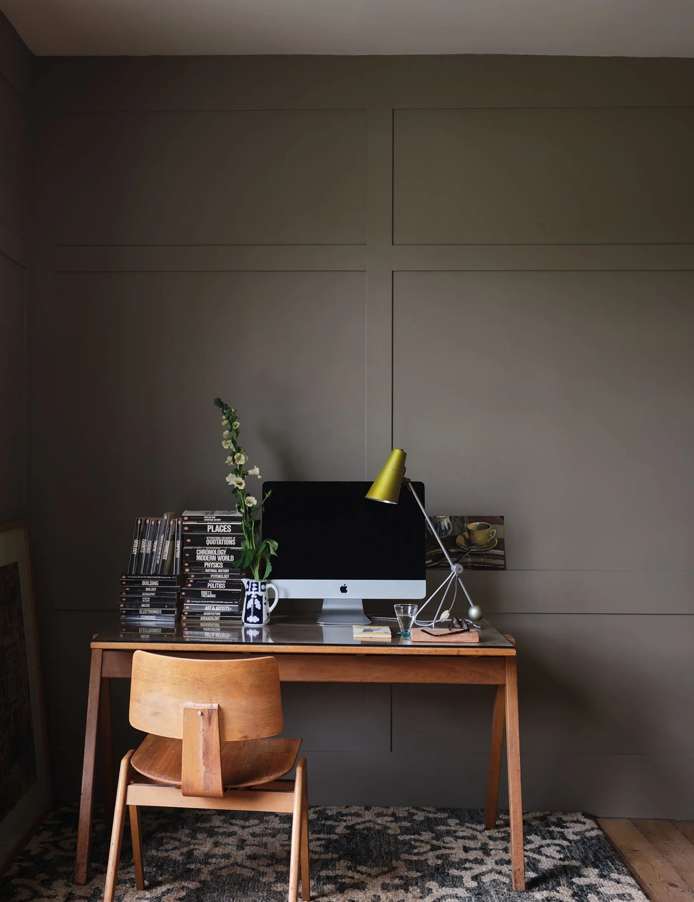
Finally we have rustic browns with a ’70s feel. We call it ‘Hot Earth’ as it reconnects us with nature in spring and summer 2023. Imagine days filled with glowing heat, and colours of burnt soil and rich umber. Perfect teamed with whites and natural wood.
Warm and engaging, this deep chocolate hue features hints of brown, black, and violet in its undertone. Stark, strong and striking, this look is both confident and simple.