“I’m A Culture Writer & I Shamelessly Judge A Book By Its Cover, Here’s Why”
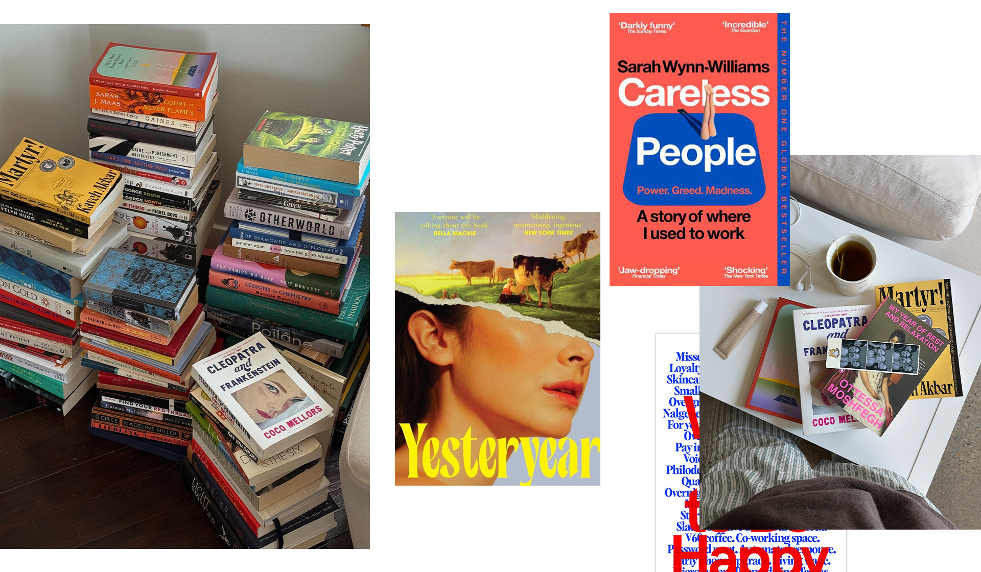
We have all heard the age-old expression “Don’t judge a book by its cover.” It’s a cautionary tale, warning us not to jump to conclusions or judge prematurely, and it’s an ideal I wholeheartedly try to live by. But taken literally, I have come to the realisation that I have a much harder time following it.
When perusing my local Waterstones, like a magpie, my eyes will always be drawn to the shiniest, most intriguing cover. When scrolling through Booktok, I will shamelessly save the videos that feature the most eye-catching designs, more often than not, before the creator has even explained the novel’s premise. Do I think this is shallow? Maybe a little. But some of my favourite reads this year also happen to have the most striking sleeves. Coincidence? I think not. So here’s my case for why judging a book by its cover isn’t always such a bad idea.
The craft of the cover
I distinctly remember when selecting novels for my A-level coursework, my teacher calling me out, saying: “You have only chosen these books because you like their covers.” An astute and absolutely correct observation. And while, yes, this shouldn’t be the primary measure for deciding whether or not to pick up a book, I am now of the mind that there is no significant issue with this.
A cover is not an afterthought slapped on to sell a book. It is the work of a graphic designer who has read the manuscript, understood its mood, and translated that into a single image. Something that, in my opinion, should absolutely be celebrated and appreciated. Just like the blurb, it provides an invaluable window into the novel.
The typography, the colour palette, the illustration style – all of it is chosen to reflect what’s inside and to honour the writer’s work. When I pick up a book because the cover stopped me in my tracks, I am responding to real craft. Recognising that effort, and letting it guide my choices, feels like a form of respect rather than a shortcut.
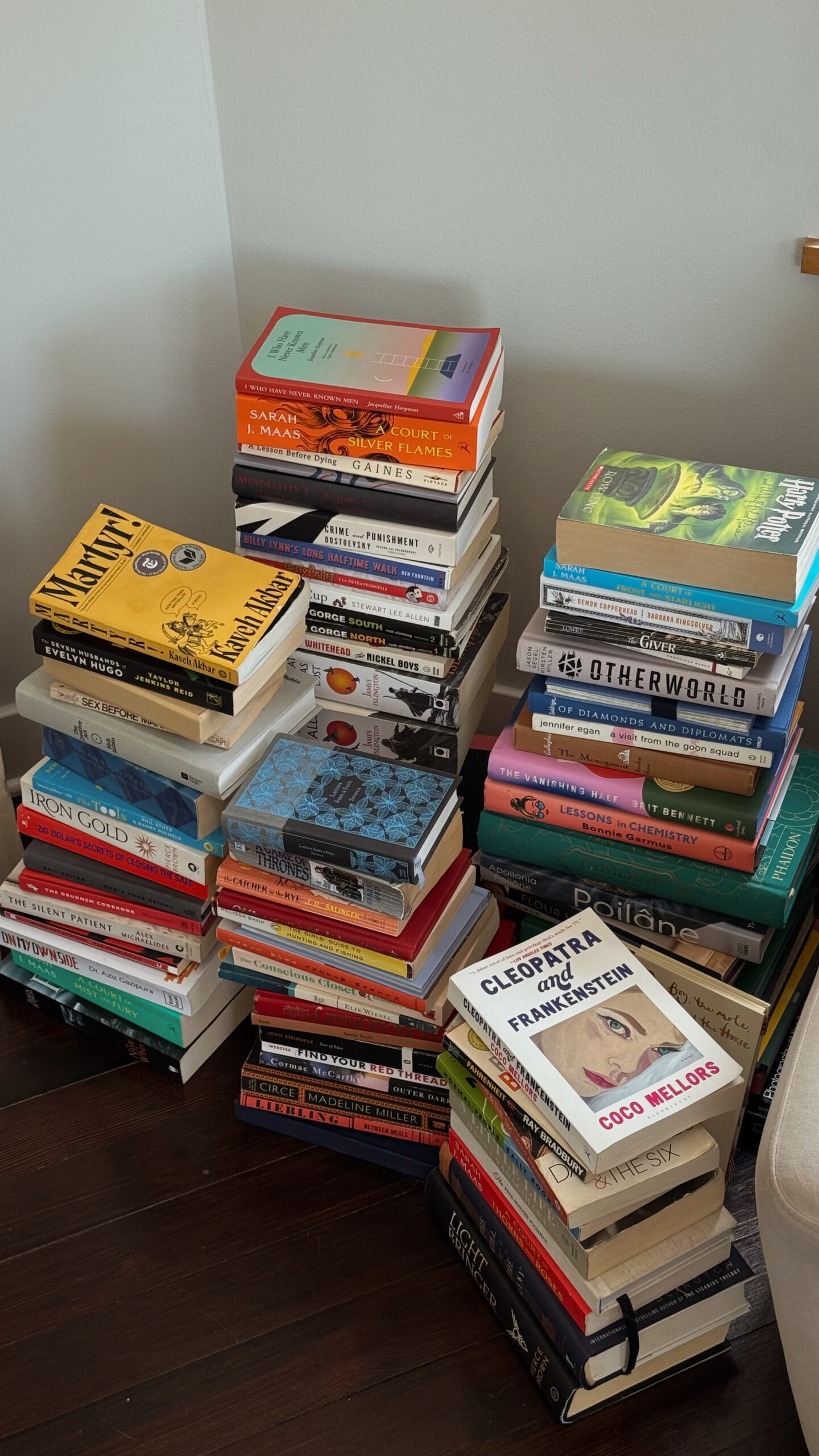
A cover is not an afterthought slapped on to sell a book. It is the work of a graphic designer who has read the manuscript, understood its mood, and translated that into a single image. Something that, in my opinion, should absolutely be celebrated and appreciated.
Amelia, Culture & Lifestyle Editor

Good branding isn’t to be underestimated
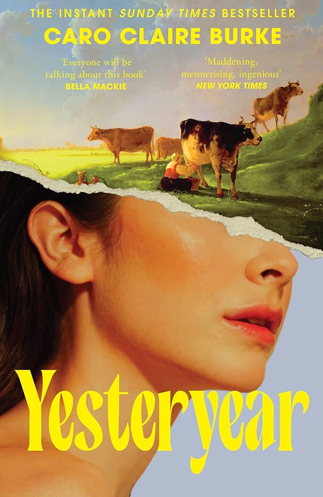
BookTok has truly changed the game. Take Yesteryear by Caro Claire Burke as a prime example of how an eye-catching cover and unique premise can catapult your book to virality in a matter of weeks.
In a visual feed built for scrolling, screenshotting and saving, a cover has, quite frankly, never held so much power. That’s not a flaw in publishing; it’s just how attention works in this media age.
We already let branding and marketing steer plenty of our other decisions. We pick oat milk based on the carton; we choose what to watch based on a poster or a trailer. Why should books be exempt from that same instinct?
Read our honest review of Yesteryear here
I’m building a library, not just a reading list
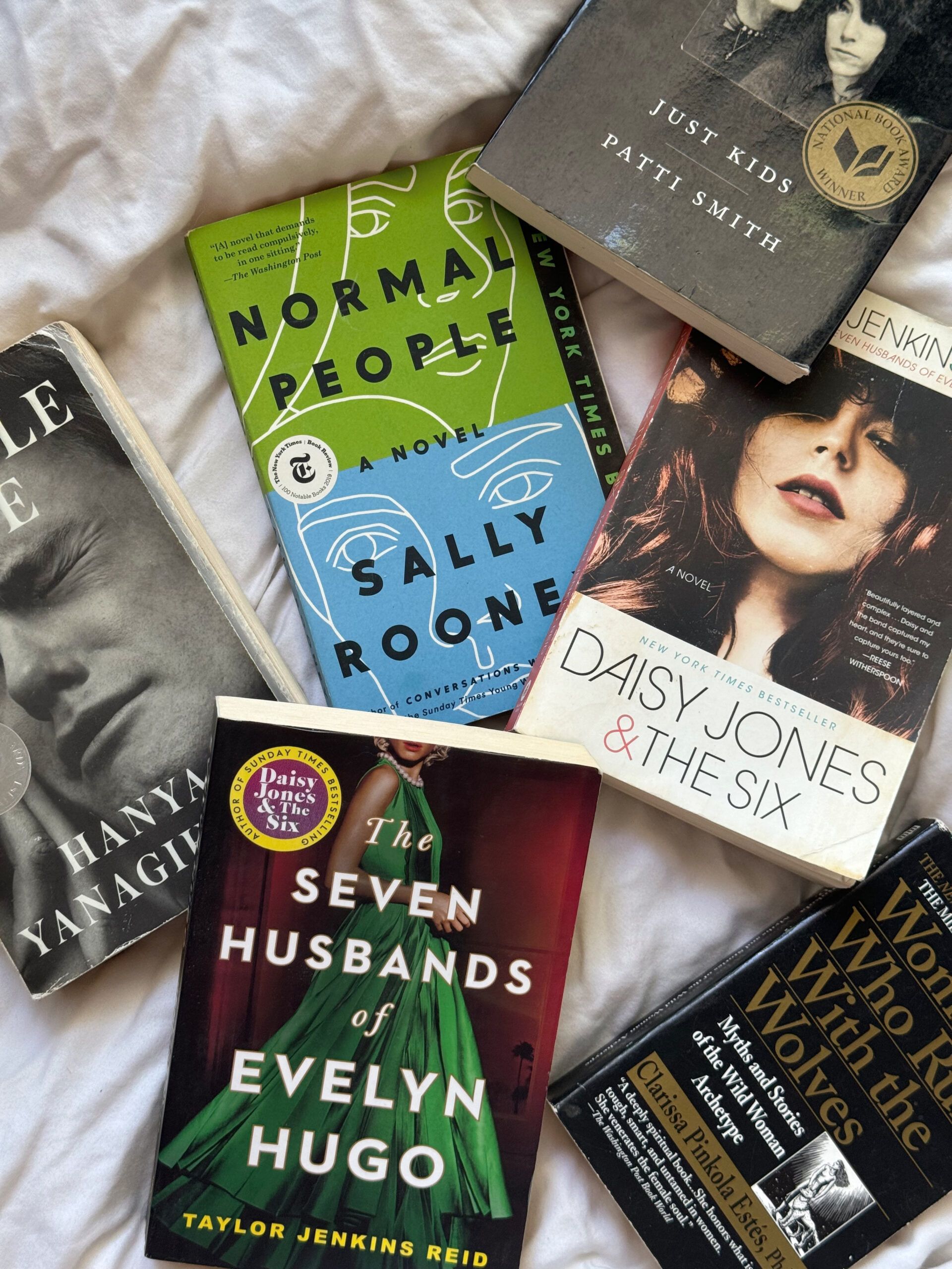

In a world where everyone seems to be switching to audiobooks and Kindles, I remain committed to the paperback cause. In fact, I have my sights set on one day being the proud owner of a pretty decadent library. An aesthetic cover carries real weight for me. It has me picturing the book’s spot on my future shelves. When my shelves double as decor, the aesthetics of a book are not a shallow bonus, they’re part of the point.
In a world where everyone seems to be switching to audiobooks and Kindles, I remain committed to the paperback cause. In fact, I have my sights set on one day being the proud owner of a pretty decadent library.
The content comes first, but the cover will always carry weight
None of this means I think a cover should outrank the writing. Of course the content matters most, and no one should pick up a book purely because they like the jacket. If that’s your sole reason for buying, you’re setting yourself up to be let down.
But there’s a difference between a cover being the only factor and a cover being a factor at all. Dismissing it as shallow ignores how much thought goes into cover design, how much our culture already runs on branding, and how much a beautiful object can add to the reading experience.
So the next time you find yourself reaching for a book purely because of how it looks, don’t feel guilty. You might just be onto something.
My 5 favourite book covers of 2026
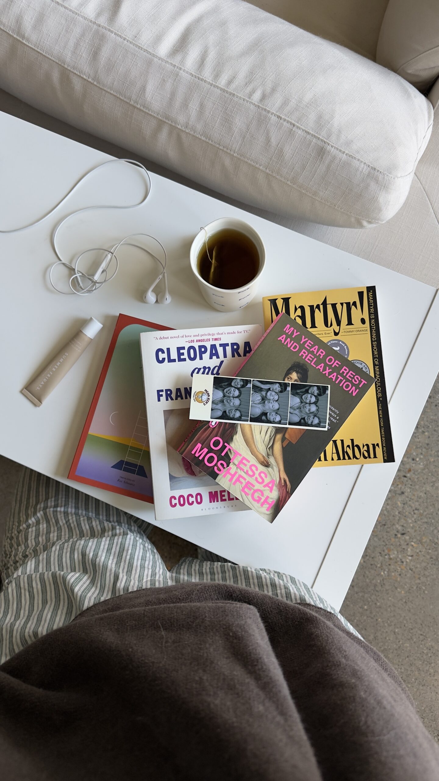
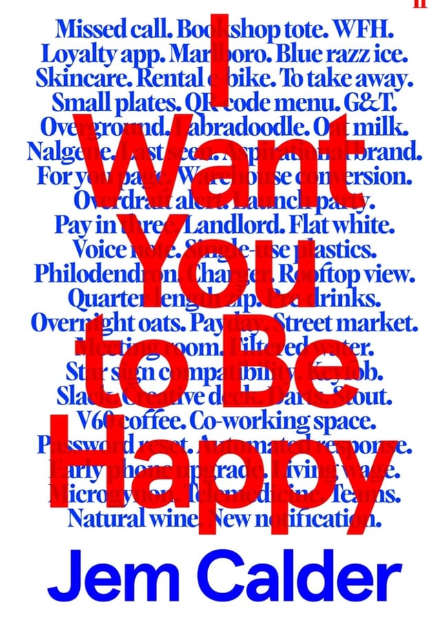
Now I have outlined my argument, it only feels appropriate to spotlight my favourite covers of the year so far. As is true for most of these, I was pulled in by the design, but stayed for the plot that unravelled once I opened the book.


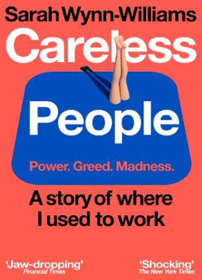
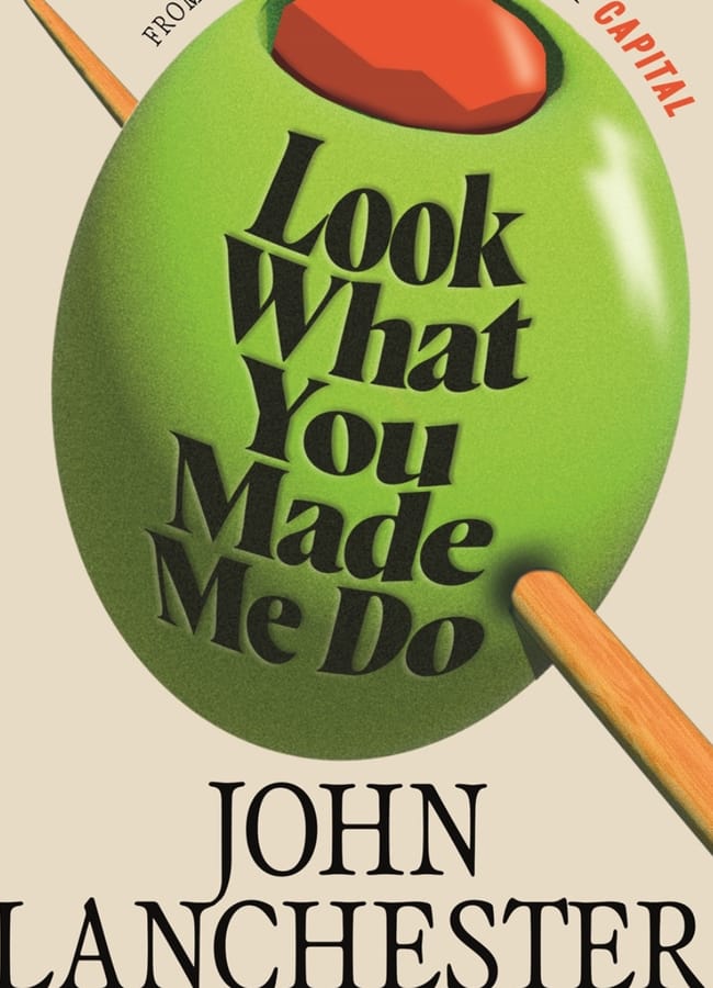
Do you judge a book by its cover?
The products on this page have been selected by our editorial team, however, The Handbook may make a small commission on some products purchased through affiliate links.