4 Unexpected Colour Combinations Worth Trying
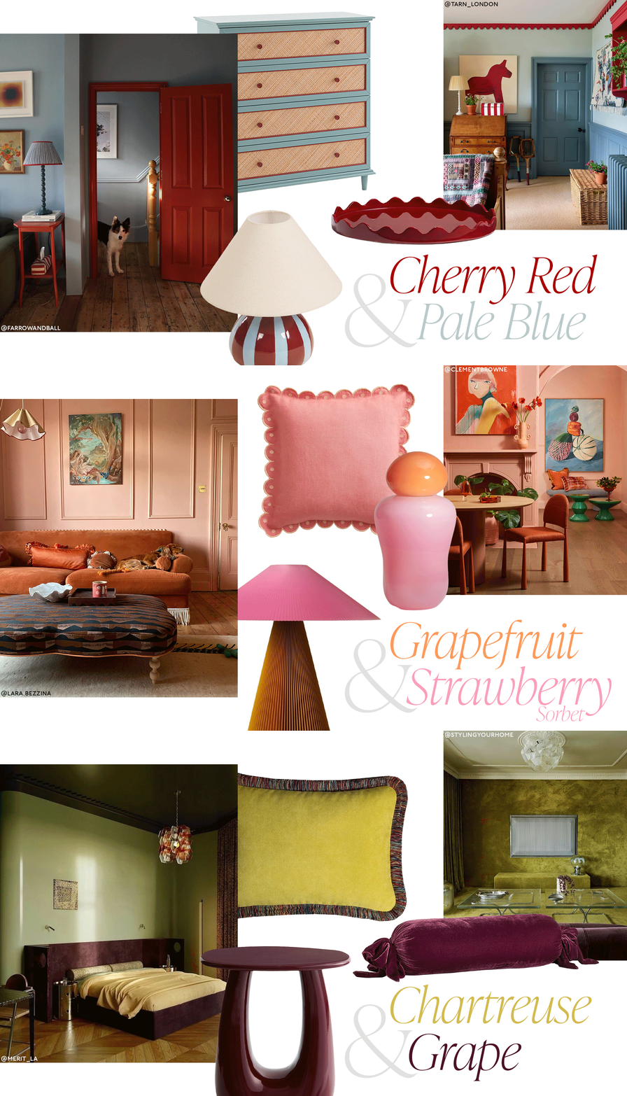
Forget playing it safe with neutral palettes, The Handbook’s Astrid Carter is always on the lookout for cool, unexpected colour combinations to bring into the home. From the return of chartreuse with a pop of grape to sexy, smoky tobacco with olive green, here are four of her current favourites and how to make them work in your space.
Cherry red & pale blue
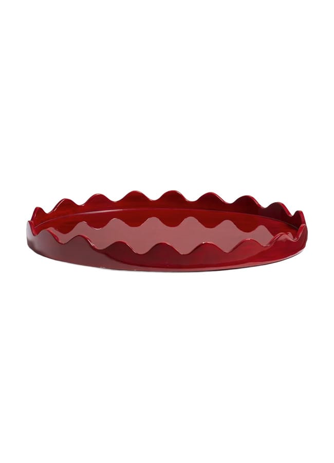
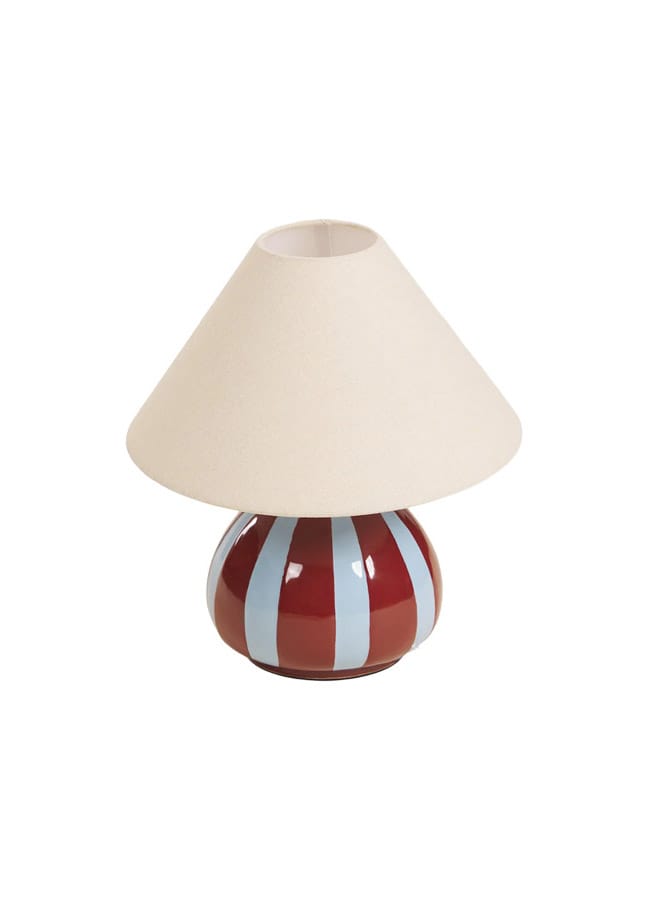
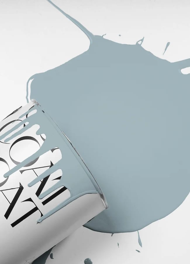
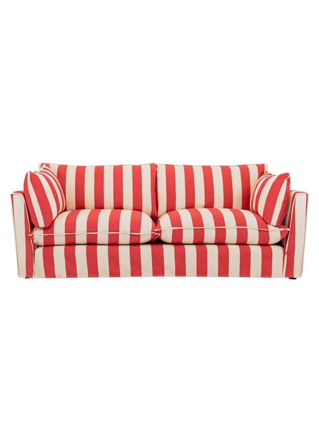
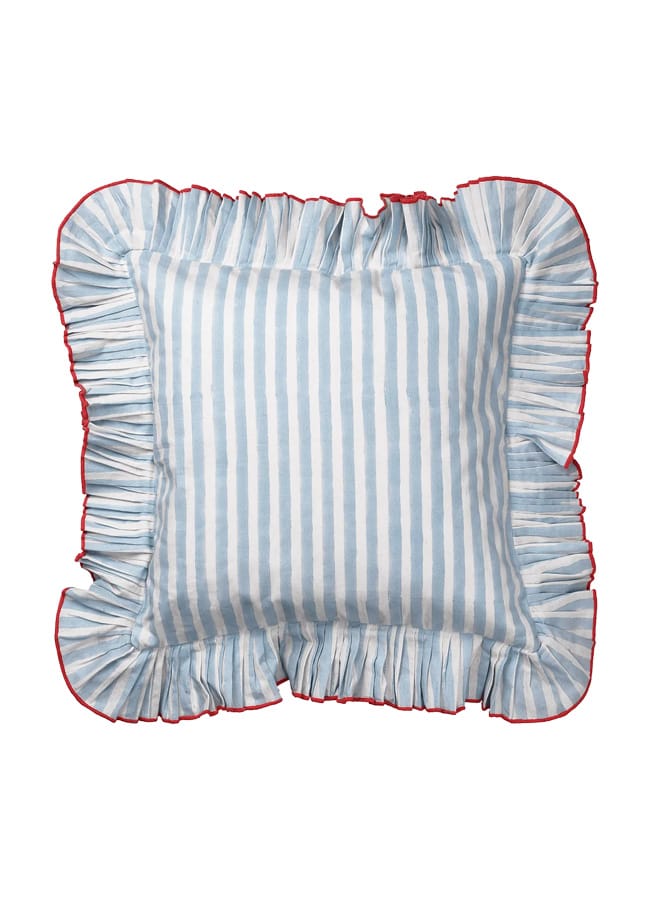
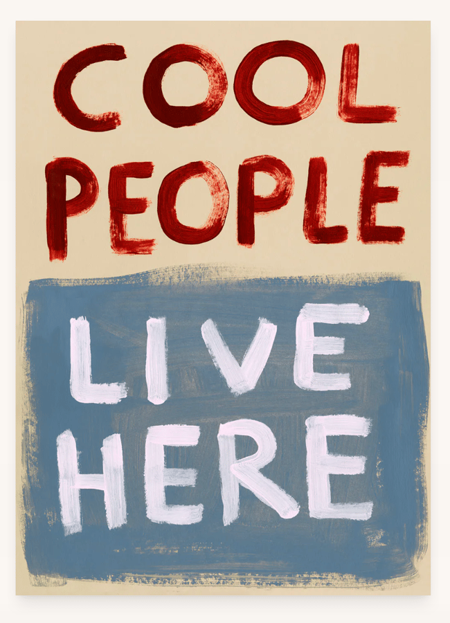
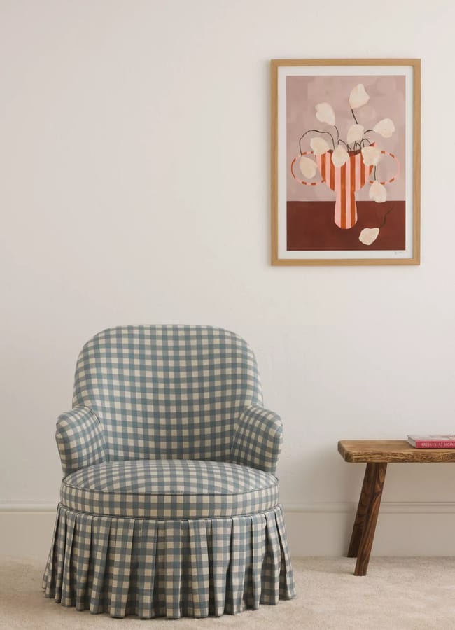
There is something so nostalgic about this colour combination. The vibrant pop of red set against cool, calming pale blue immediately brings retro children’s bedrooms to mind – making it my absolute favourite palette for little ones’ spaces.
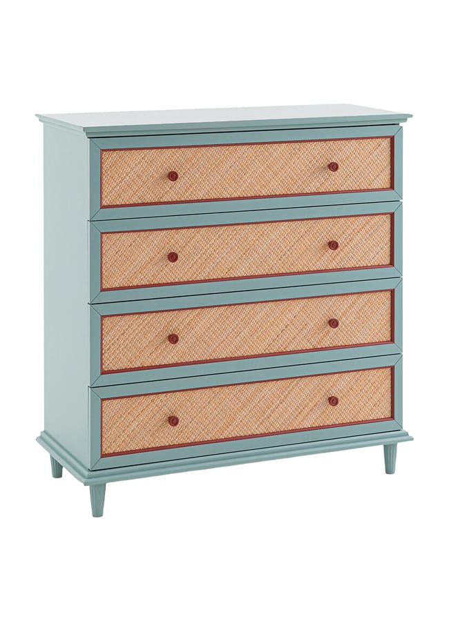
I love pieces that blend the two directly, like The Masie’s sweet striped table lamp or La Redoute’s charming pale blue wicker drawers, accented with rich cherry knobs and trim. The duo also brings a lovely cottagecore feel to living rooms – think red striped sofas and blue gingham soft furnishings grounded by rustic seagrass rugs and warm, dark vintage wood.
GET THE LOOK…
Chartreuse & grape
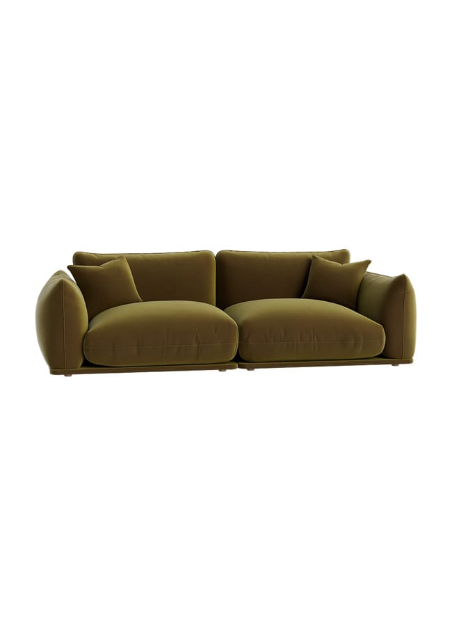
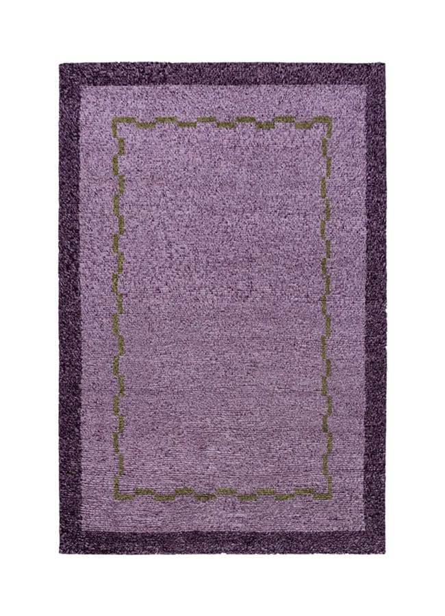
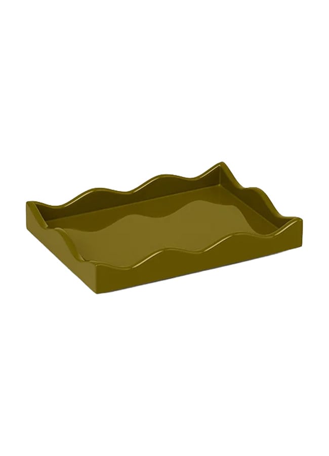
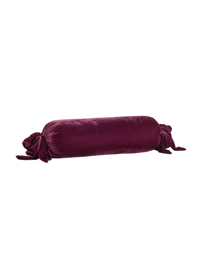
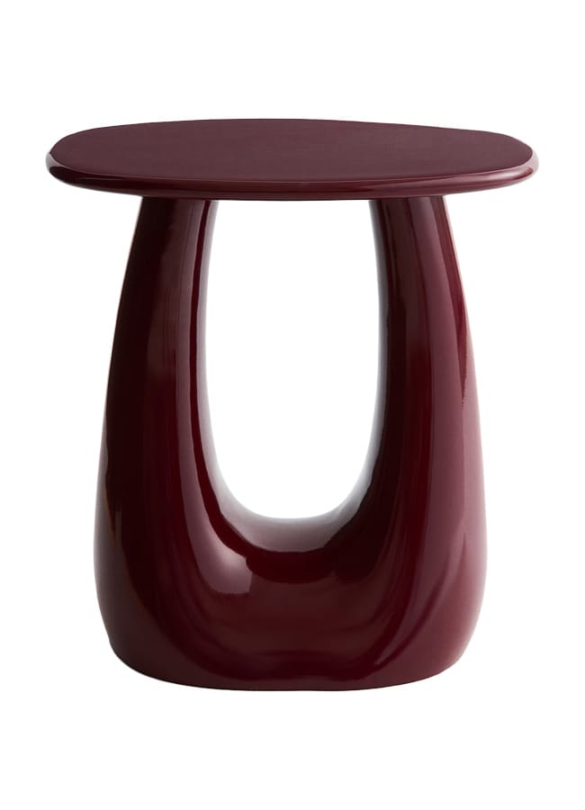
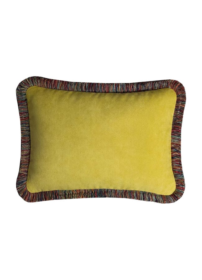
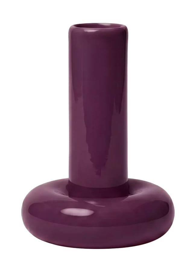
Granted, this one isn’t for everyone, but done right, it can be delightfully playful and completely unexpected. Chartreuse is definitely having its moment once again, both in interiors and fashion, and it pairs brilliantly with a rich, grapey purple.
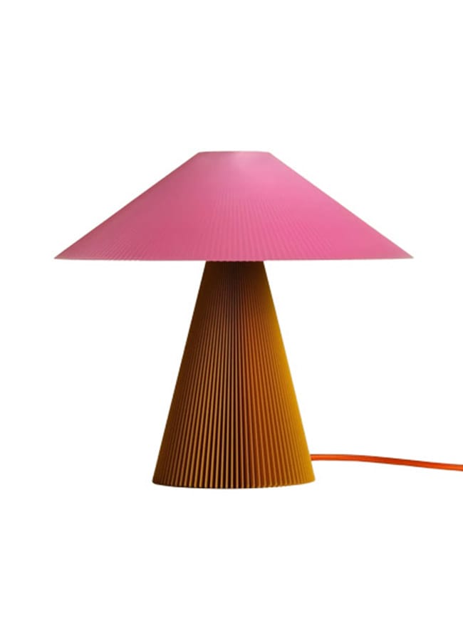
Purple can be tricky to pull off at home – it easily veers into late-90s/early-noughties Changing Rooms territory – but lean into its bold, cartoonish tones, and it can feel really fun. Think chubby modular sofas, shaggy rugs, glossy lacquered furniture, and sculptural, interesting lighting.
GET THE LOOK…
Grapefruit & strawberry sorbet
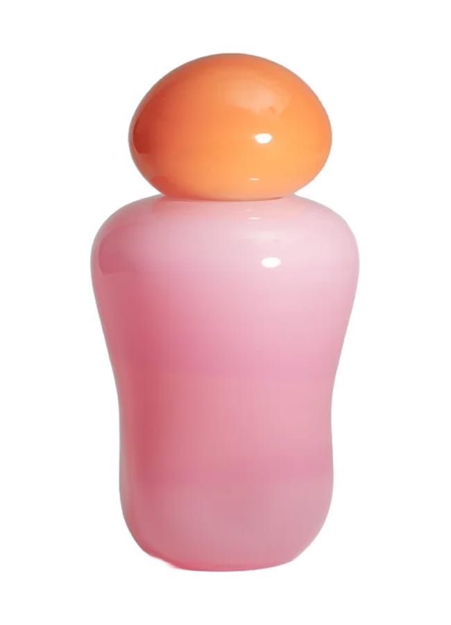
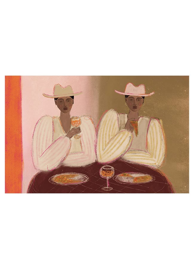
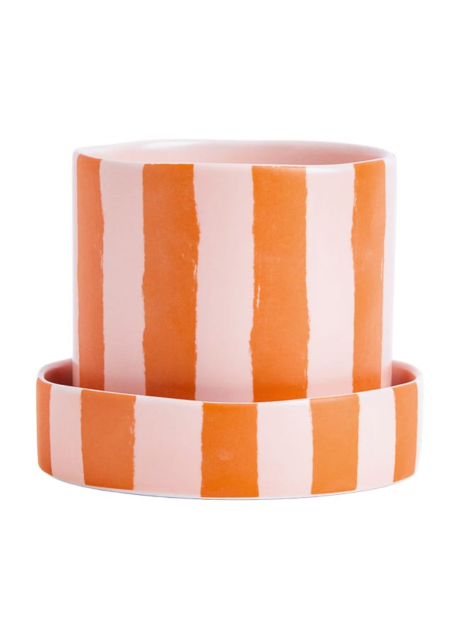
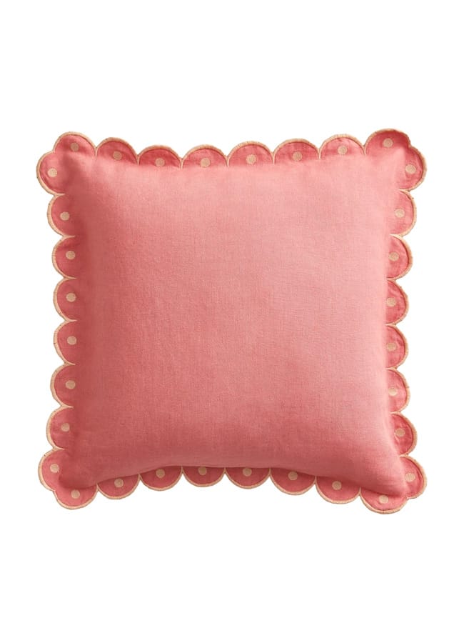
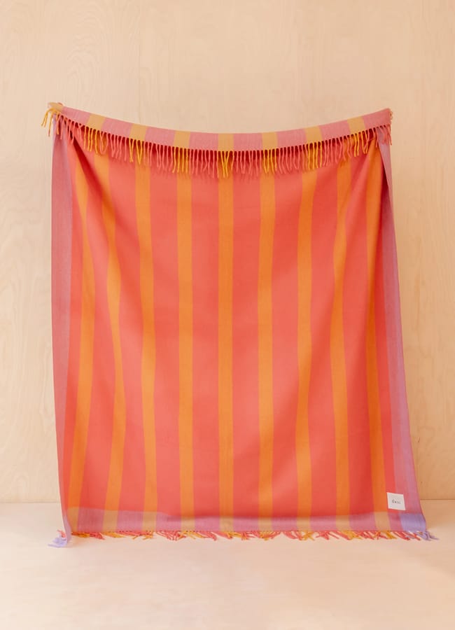
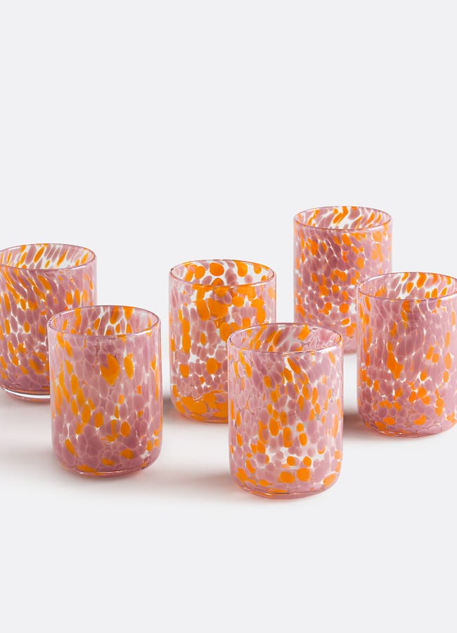
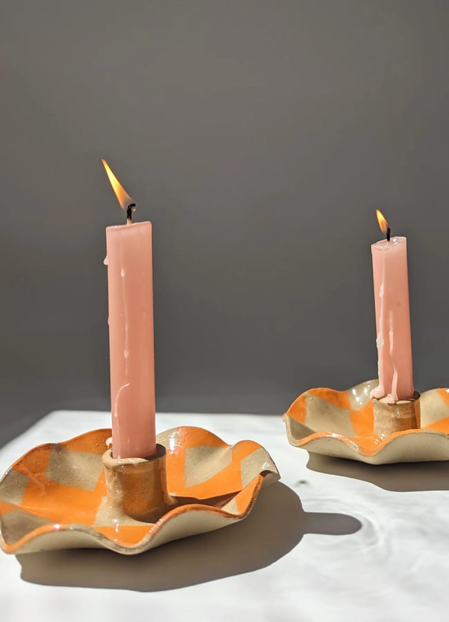
If you absolutely refuse to embrace warm, earthy tones this autumn, this colour combination might be for you. Packed with the punchy joy of summer sorbet and juicy citrus fruit, this pink-meets-orange partnership brings instant freshness to any space.
I particularly love a brave shade of pink drenched across walls, ceilings, and door frames. Despite its high-spirited feel, it can feel surprisingly cosy and comforting, too. Layer in zesty orange accents – tangerine and grapefruit are personal favourites – through soft furnishings or art prints. And if you aren’t ready to commit to the entire room, it works brilliantly as a vibrant tablescape palette instead.
GET THE LOOK…
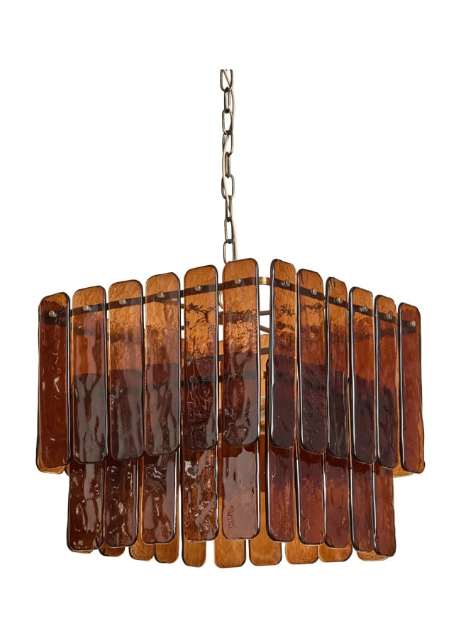
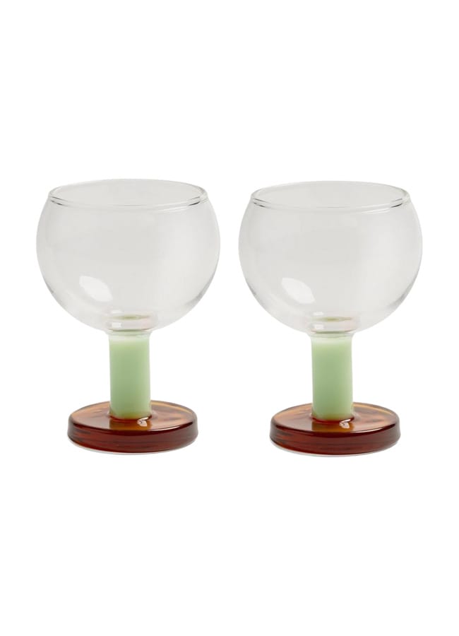
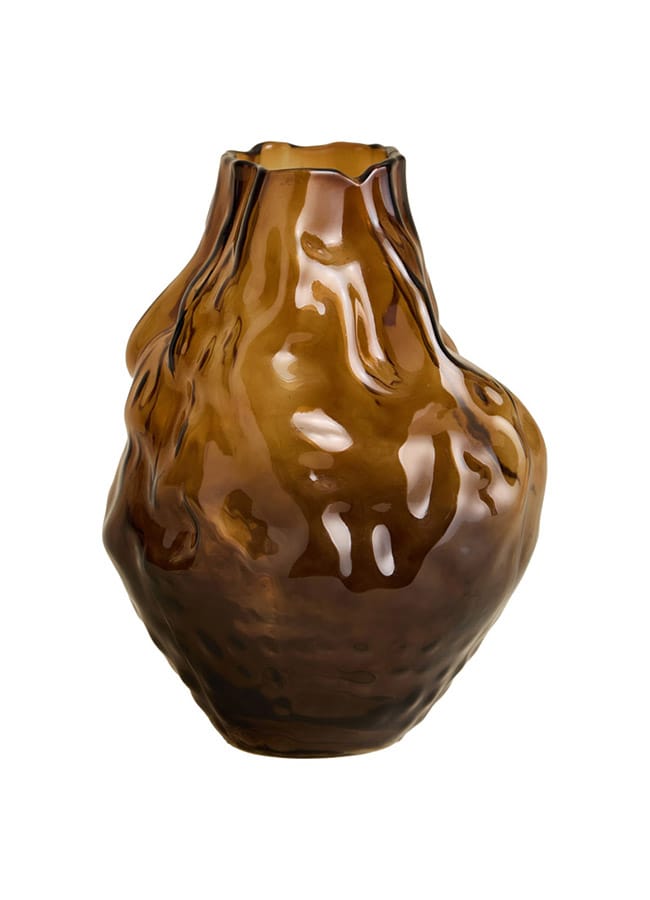
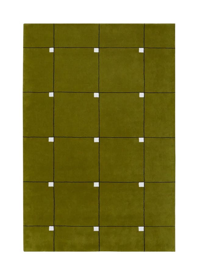
Tobacco & olive green
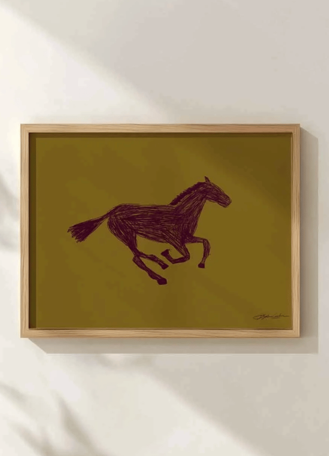
There is no denying it, rich brown tones have dominated fashion and interiors over the past year, but this combo offers a fresh take on the trend. Enter tobacco and olive green: think moody drinking dens, after-hours rooms made for after-hours, and sophisticated spaces that feel deeply layered in both colour and style.
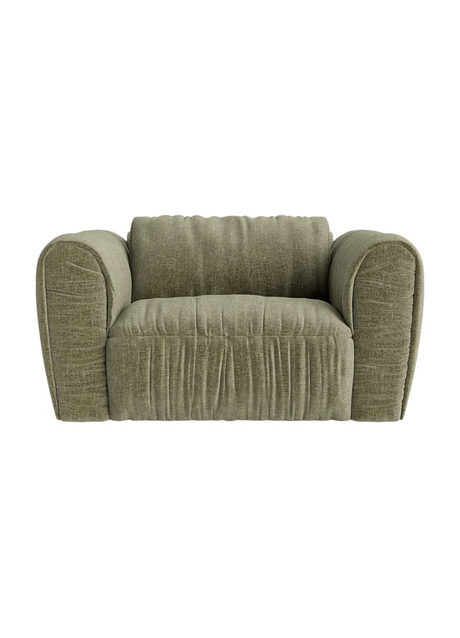
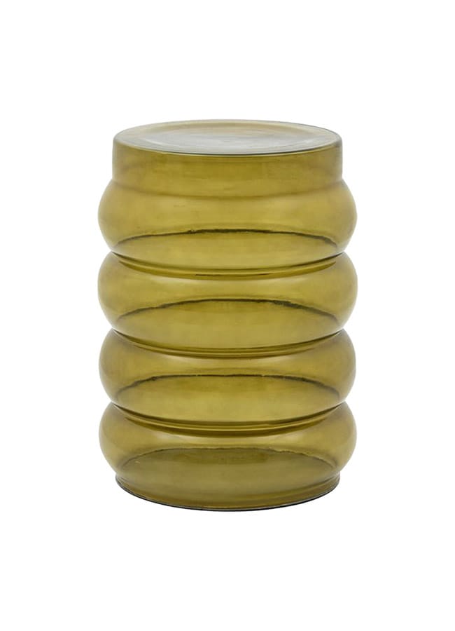
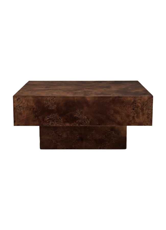
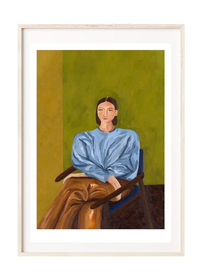
I love the idea of the rich, smoky burl wood coffee table by Cult Furniture, lit up with M&S’s chandelier in retro tobacco squares. Pep that up with the ultimate It-girl shade, olive green – think sleek cocktail glasses, modern portraiture, and chunky modular seating. It’s the ultimate palette for a room made for sipping martinis long into the evening.
GET THE LOOK…
The products on this page have been selected by our editorial team, however, The Handbook may make a small commission on some products purchased through affiliate links.